Modblot's Sketchbook
#1
HI FRANDS! Here's my current stuff I've been working on. I have some older stuff sitting on a CD disk somewhere in my garage that I might dig up at some point.

Here's some of my stuff from about a year ago that was more comic style driven.


Attached Files Image(s)


twitter  |  facebook  |  instagram  | comic  
Reply
#2
Here's some new stuff, I'm trying to push more into realism and really working on understanding figure/lighting form more.


Attached Files Image(s)


twitter  |  facebook  |  instagram  | comic  
Reply
#3
Ha some hilarious stuff in here, welcome aboard buddy! Keep on posting :D
Reply
#4
Current work-in-progress stuff...


Attached Files Image(s)


twitter  |  facebook  |  instagram  | comic  
Reply
#5
[Image: attachment.php?aid=70466]

Yes... YES...

This is perfect. Keep doing what you're doing, I beg you.
Reply
#6
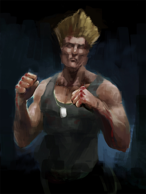
Finished this Guile last night.


Attached Files Image(s)


twitter  |  facebook  |  instagram  | comic  
Reply
#7
Cool work here man. I loved the comic stuff. It is really well done.

Do you add color with a soft light layer above the values?

Reply
#8
Jesus, dat Seal is godly:D

I love how you show us your process, especially for Guile, I like how you included the sketches and variants. There are tons of them lol. That's my bane, properly starting and finishing things, so respect for that:)

Keep calm and get in the robot

My sketchbook
Reply
#9
(07-17-2015, 10:34 AM)iamorim Wrote: Cool work here man. I loved the  comic stuff. It is really well done.

Do you add color with a soft light layer above the values?
Yeah, it depends on what I'm trying to do with the color. Photoshop's layer mode are kind of weird and they are very dependent on the grey value of the color.

Like, if you want to add color subtly at first, pick soft light layer blending mode, pick the color you want, and make sure it's 50% grey also. (see attached pic)

If your goal is to add a lot of saturation or get a glowing effect, you should probably use overlay. Overlay blending mode will add saturation upon saturation, soft light dials it way down and tends to not add saturation up.

I use Manga Studio 5 and I use soft light layers to start adding color. At some point I flatten everything and just start using my eye to add color and pick colors from the color picker and palette. And if I want to do some sort of effect, I use an Add (glow) layer in Manga Studio, but I try my best to not rely on layer blending modes and just paint what I see.


(07-17-2015, 11:42 AM)Doolio Wrote: Jesus, dat Seal is godly:D

I love how you show us your process, especially for Guile, I like how you included the sketches and variants. There are tons of them lol. That's my bane, properly starting and finishing things, so respect for that:)

Thanks! That Guile painting was like a huge step in growth for me and it was because I was ruthless with myself. I completely finished 2 black/white value studies and decided to start over because it just didn't feel right. 

I think the most important step in finishing a piece of art is the sketch stage, where you set up the values. If your sketch is rough and isn't thought-out, you might start on the color and finishing the piece and then you get into a spot where you are really stuck and can't solve it and now you've dumped a ton of time into it.

I got near the end of the painting and decided Guile's face was wrong, so I made a new layer, I painted his whole face black, and started over lol. It was hard, but I'm happier with the face now.


Attached Files Image(s)


twitter  |  facebook  |  instagram  | comic  
Reply
#10
Here's that Guile face progress. The lighting was wrong, the light wasn't wrapping around the features right, so I started over and got some photo reference to use for the lighting. Started layering up the light from dark.


Today's studies. Searched for "Rotted Face" on Google Image Search. Also found a cool samurai dude to draw.


Attached Files Image(s)


twitter  |  facebook  |  instagram  | comic  
Reply
#11
Hey, man! Here's that paintover you asked for :)

So it's really rough because at the last few minutes I decided to change everything I had previously done (involving re-painting the entire head). One of the main things I wanted to put forward is that from looking at images on google, his face as a very specific construction - A heavy set brow and sharp, angular jaw and cheek bones. Hiding it behind glasses makes it harder to know who he is. I guess the hair gives it away but still, getting that action-hero face right would probably make fans like it more. 

Another thing is the pose. In your image he was looking the same direction as his body. In this there is a rhythm to his pose where he is turning his head away from his body. It gives it a bit more gesture and attitude. 

I also made his hair a little more realistic. That's mostly a preference thing but from the images I saw, he often had a bit of "shape" to his hair rather than it being a flat disk. 

Anyway, I hope it helps illustrate a few points ^^


Discord - JetJaguar#8954
Reply
#12
(07-24-2015, 07:03 AM)Tristan Berndt Wrote: Hey, man! Here's that paintover you asked for :)

Thanks so much for the paintover, learned a lot from looking at what you changed and improved.

twitter  |  facebook  |  instagram  | comic  
Reply
#13
This is one of the most informative sketchbooks I've seen on here! Especially the post about using layer effects in Photoshop (despite using PS, I had no idea it was so reliant on grey values), and the process posts. Thank you very much for this, and keep on being awesome!! :D

Reply


Forum Jump:


Users browsing this thread: 8 Guest(s)