Demon painting (please help!)
#1
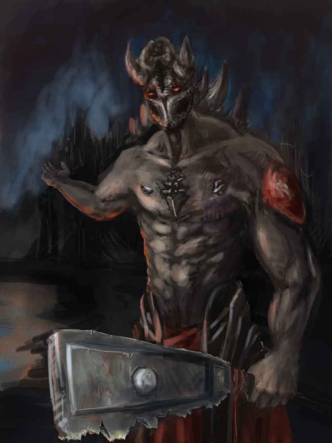
Hello everyone, I'm having a hard time with the creature in the foreground. I wanted the anatomy to be kind of pushed to the extreme, but i'm not sure how successful i've been. Also the lighting feels really weird, along with the foreshortening. I would love some help and feel free to be as harsh as you want. Also i've been having some trouble with this file uploading and looking different than it does on my screen, anyone know why that happens?


Attached Files Image(s)


Reply
#2
I'm not good enough at anatomy to pinpoint it, but maybe looking at the model here might provide some insight? http://www.posemaniacs.com/category/bodybuilding

Reply
#3
Main light source direction in this image can't be determined. 

Most of the image is in a grey zone with the brightest spot being 73% on the jagged edge of the blade. This creates weak focal areas especially when the image isn't using color to create focal areas. 

I did some paint over, and used Photoshop's Transform tool to put the stretching hand into more perspective. You can to the same for the cleaver. I also changed the background to try and frame the demon better, and also framed one thing in the bg for him to gesture towards. 


Focus.
Reply
#4
(08-12-2015, 06:43 AM)meat Wrote: Main light source direction in this image can't be determined. 

Most of the image is in a grey zone with the brightest spot being 73% on the jagged edge of the blade. This creates weak focal areas especially when the image isn't using color to create focal areas. 

I did some paint over, and used Photoshop's Transform tool to put the stretching hand into more perspective. You can to the same for the cleaver. I also changed the background to try and frame the demon better, and also framed one thing in the bg for him to gesture towards. 

Wow thanks meat! I'll take all of this into consideration when i start working on this piece again.
Reply


Forum Jump:


Users browsing this thread: 8 Guest(s)