05-10-2016, 02:16 PM
Yo Tiana!
One step from finished indeed - it's a really cool design, I really like it!
 Fantastic job on makin' a cool character <3
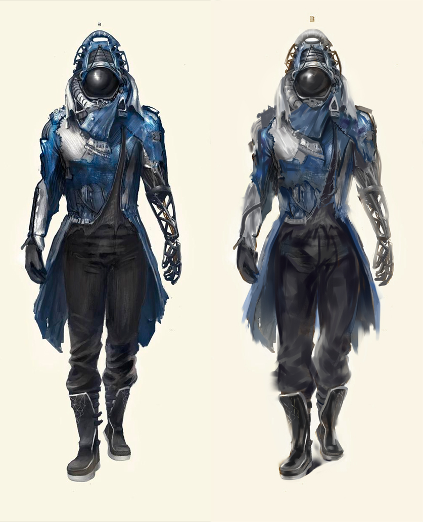
I did a thing to give some tips on what to consider working on to push it to the final stage, hope you don't mind:

So from what I can tell - you're going for more of a realistic style? If I'm incorrect lol disregard below:
*Edges - as a general rule, materials such as cloth are able to have a softer edge (where necessary) vs hard materials like metal. The contrast between hard v soft throughout an image can really make an image pop + make for a more realistic piece. Edges are also fantastic for creating focus in a piece, for e.g. your eyes won't stay fixed on out of focus edges, they're more likely to try and find a harder edge (something with detail). Use this to your advantage in your images. Try to lead the eye to your focal point with this idea; experiment with edges <3 you'll be surprised how much of an advantage they can be.
*Colour - it's tempting to over-saturate colour to get an image to pop, but surprisingly, it's the more de-saturated palette with hints of colour that works wonders for colour. You can see this in master paintings all the time - they know their colour haha. For some of the cloth that you added, you went very white with a lot of it. But the truth is, there's a lot of colour in white cloth because of the white bouncing quite a bit off of other materials etc. .. but I mean damn - it's the same with many kinds of materials. Always consider what one material next to another could effect under different light sources. This is why still life studies are fantastic - if you work on it, eventually you'll be able to visualise what a particular object will look lkike under a specific light source etc etc
*Brush strokes - make sweet, sweet love to your brush strokes. Don't be afraid to try something new, experiment, be bold. It's a fun game. I pretty much made a new layer over your piece and got loose. If that's not your style, again, disregardos haha
*Textures + Materials - I would recommend doing texture studies after this piece. It's always important to first describe the form real good, with textures enhancing the form afterward. Then, experimenting with your process can be fun af. Up to you :)
Materials - really emphasising different types of materials can create visual interest. Like what I did with the boots, for e.g.
*Atmosphere - to add a bit of oomph and perhaps give a little more story to your character, I used a soft brush, colour picked the background and subtly brushed over in areas that could be pushed back a bit & in doing so, give a dusty look - really emphasising the torn elements of his attire and whatnot. This was what really got the image to the next level, after edges.
*Is he floating? :O! Haha added core shadow under his feet. If you planned him to be floating or smth, disregard. But yeah, that stuck out like a sore thumb to me. Always gotta indicate that a character has weight and solidity via shadow placement.
*The 3 - made it a taaaaad larger and placed it a taaaaaad higher. It was just a bit too small.
Aaaaaaaaaah yeah, there's my 2cents Tiana!
I hope this helps you out - even a little bit <3
Can't wait to see this finished !
!
One step from finished indeed - it's a really cool design, I really like it!

 Fantastic job on makin' a cool character <3
I did a thing to give some tips on what to consider working on to push it to the final stage, hope you don't mind:

So from what I can tell - you're going for more of a realistic style? If I'm incorrect lol disregard below:
*Edges - as a general rule, materials such as cloth are able to have a softer edge (where necessary) vs hard materials like metal. The contrast between hard v soft throughout an image can really make an image pop + make for a more realistic piece. Edges are also fantastic for creating focus in a piece, for e.g. your eyes won't stay fixed on out of focus edges, they're more likely to try and find a harder edge (something with detail). Use this to your advantage in your images. Try to lead the eye to your focal point with this idea; experiment with edges <3 you'll be surprised how much of an advantage they can be.
*Colour - it's tempting to over-saturate colour to get an image to pop, but surprisingly, it's the more de-saturated palette with hints of colour that works wonders for colour. You can see this in master paintings all the time - they know their colour haha. For some of the cloth that you added, you went very white with a lot of it. But the truth is, there's a lot of colour in white cloth because of the white bouncing quite a bit off of other materials etc. .. but I mean damn - it's the same with many kinds of materials. Always consider what one material next to another could effect under different light sources. This is why still life studies are fantastic - if you work on it, eventually you'll be able to visualise what a particular object will look lkike under a specific light source etc etc
*Brush strokes - make sweet, sweet love to your brush strokes. Don't be afraid to try something new, experiment, be bold. It's a fun game. I pretty much made a new layer over your piece and got loose. If that's not your style, again, disregardos haha
*Textures + Materials - I would recommend doing texture studies after this piece. It's always important to first describe the form real good, with textures enhancing the form afterward. Then, experimenting with your process can be fun af. Up to you :)
Materials - really emphasising different types of materials can create visual interest. Like what I did with the boots, for e.g.
*Atmosphere - to add a bit of oomph and perhaps give a little more story to your character, I used a soft brush, colour picked the background and subtly brushed over in areas that could be pushed back a bit & in doing so, give a dusty look - really emphasising the torn elements of his attire and whatnot. This was what really got the image to the next level, after edges.
*Is he floating? :O! Haha added core shadow under his feet. If you planned him to be floating or smth, disregard. But yeah, that stuck out like a sore thumb to me. Always gotta indicate that a character has weight and solidity via shadow placement.
*The 3 - made it a taaaaad larger and placed it a taaaaaad higher. It was just a bit too small.
Aaaaaaaaaah yeah, there's my 2cents Tiana!
I hope this helps you out - even a little bit <3
Can't wait to see this finished
 !
!
sketchbook | pg 52
"Not a single thing in this world isn't in the process of becoming something else."
I'll be back - it's an odyssey, after all
"Not a single thing in this world isn't in the process of becoming something else."
I'll be back - it's an odyssey, after all


