05-19-2016, 10:56 AM
Edit: rewrote most that I could remember from what was lost
Hey man!
Haha gotta say, I really dig this thread - revamping old Heavy Metal CD covers is a dope idea!
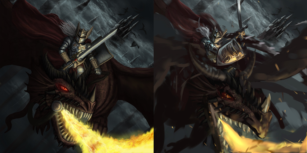
Hmm, alrighty, so I like where you're goin with this design. I do feel like there's a couple things that could really make the design *pop*! I did a quick thing, to try and demo what I mean, I hope ya don't mind <3:

Firstly, I'll talk about improving on your foreshortening ish. If you're having trouble with foreshortening, you're having trouble with something fundamental. This is something you've gotta know! Head back to your books on anatomy; I personally would recommend Loomis' "Figure Drawing For All It's Worth" - the section on "arcs of movement" is glorious for understanding this imo (note: if you have trouble understanding this section, go to the section before - if you have trouble with the section before, go to the section before *that*, etc. Or, if you're still having trouble, perhaps look around for the missing jigsaw piece you need for e.g. perspective. Seriously man, don't neglect this stuff. You don't want to have go rely on reference - for a little bit of aid, sure - but it makes the whole process a lot easier and quicker when you know the basics).
Alright, now for a quick-ish rundown of what I changed and why:
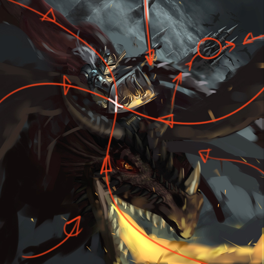
By designing the wings and cape in an "S" shape, we've got balance horizontally and vertically, giving us a nice "X marks the spot" on the shield of the Rider, pin pointing our focal point. Now in order to emphasise the Rider as the prominent badass in the piece, I had to decrease the intensity of the fire, as it was overwhelming and I found my eyes looking back there every other second (then added a couple of embers and sparks coming off the flames for added detail, realness, dynamism etc).
The tail is also designed with an "S" shape to contort around the sub-focal point - the castle. I got rid of the knight wielding the sword vertically against the castle to let the castle breathe (also, you know when you photograph someone and then you look back at the picture afterward and realise they have a huge pole sticking out of their head? Kinda what this reminded me of haha). With the sword now angled, and the tail blooming behind, leading to the castle, we have our background focal point distinguished.
One other thing I noticed, was that you seemed to have brushed over describing the form first before getting into the detailing/texturing stage? If this is you describing form to the best of your ability - I'd recommend studying form like a 3d application. What I mean is to try to think about everything as if it has wireframes around it; this'll make seeing and understanding light on a 3d form a lot easier. Like, damn. Then pass this onto other studies ya do like still lives and shit. Just a recommendation, up to you <3
Oh! And! Materials and edges (this is also why I brought up still lives haha)! You've gotta know your materials man. If I had more time I'd have gone in and made that knights armour reflective af, as well as other elements.
Now in terms of edges - I didn't really change much, you did good! What I did add though was some motion blur, to give a sense of movement (a dragon flying through the air and whatnot). I added this rather subtly to the wings, tail, dragons head and fire (the latter two because I didn't want there to be sharpened edges on the dragon/fire for the viewer to get stuck on).
Aaaahhhh, I think that's the majority of what I wrote up before I lost all of it.... hmm...
But either way, I hope that even a little bit of this has helped ya out.
Keep up the good fight man! o/
Hey man!
Haha gotta say, I really dig this thread - revamping old Heavy Metal CD covers is a dope idea!
Hmm, alrighty, so I like where you're goin with this design. I do feel like there's a couple things that could really make the design *pop*! I did a quick thing, to try and demo what I mean, I hope ya don't mind <3:

Firstly, I'll talk about improving on your foreshortening ish. If you're having trouble with foreshortening, you're having trouble with something fundamental. This is something you've gotta know! Head back to your books on anatomy; I personally would recommend Loomis' "Figure Drawing For All It's Worth" - the section on "arcs of movement" is glorious for understanding this imo (note: if you have trouble understanding this section, go to the section before - if you have trouble with the section before, go to the section before *that*, etc. Or, if you're still having trouble, perhaps look around for the missing jigsaw piece you need for e.g. perspective. Seriously man, don't neglect this stuff. You don't want to have go rely on reference - for a little bit of aid, sure - but it makes the whole process a lot easier and quicker when you know the basics).
Alright, now for a quick-ish rundown of what I changed and why:
- Dragon head - enlarged the head, for proportion, as well as makin the dragon a bit more menacing
- Dragon eye - not as prominent (the eye was initially as bright as the riders suit of armour - but the focus should be on the rider, not the dragon - at least with a title like "Dragon Knight" I would think so haha :3).
- Dragon mouthpiece - abandoned. It's a dragon, not a horse haha. I didn't think this design made sense, I did however imply the rider is mounted on a saddle of some kind
- Light on local colour is affected by what's around it - e.g. red cape + white-blue moonlight = purplish accents, etc.
- Horns - brightened and lengthened. Used somewhat as a compositional element, similarly to the
- Wings, cape (great rendering on the cape btw <3) and tail - firstly, I changed the wings from the horizontal position you had them posed in, in favour of something a little more dynamic. If I really wanted to give off the impression that the dragon is darting through the skies, I'd have gone for a more action-bound pose for the wings, for e.g. when the wings are either at the top or bottom of its flight pattern; it is at the peak time of an action that a pose = extremely dynamic e.g. when a golfer either reaches the peak of his swing pre-hit, or the peak of his swing post-hit. So if you were going for dynamism, you wouldn't draw the golfer with his club positioned as it's about to hit the ball - it looks static. Anyway, I decided against this to really inform the composition design. The cape and tail were also used in aiding the comp design, as seen below:

By designing the wings and cape in an "S" shape, we've got balance horizontally and vertically, giving us a nice "X marks the spot" on the shield of the Rider, pin pointing our focal point. Now in order to emphasise the Rider as the prominent badass in the piece, I had to decrease the intensity of the fire, as it was overwhelming and I found my eyes looking back there every other second (then added a couple of embers and sparks coming off the flames for added detail, realness, dynamism etc).
The tail is also designed with an "S" shape to contort around the sub-focal point - the castle. I got rid of the knight wielding the sword vertically against the castle to let the castle breathe (also, you know when you photograph someone and then you look back at the picture afterward and realise they have a huge pole sticking out of their head? Kinda what this reminded me of haha). With the sword now angled, and the tail blooming behind, leading to the castle, we have our background focal point distinguished.
One other thing I noticed, was that you seemed to have brushed over describing the form first before getting into the detailing/texturing stage? If this is you describing form to the best of your ability - I'd recommend studying form like a 3d application. What I mean is to try to think about everything as if it has wireframes around it; this'll make seeing and understanding light on a 3d form a lot easier. Like, damn. Then pass this onto other studies ya do like still lives and shit. Just a recommendation, up to you <3
Oh! And! Materials and edges (this is also why I brought up still lives haha)! You've gotta know your materials man. If I had more time I'd have gone in and made that knights armour reflective af, as well as other elements.
Now in terms of edges - I didn't really change much, you did good! What I did add though was some motion blur, to give a sense of movement (a dragon flying through the air and whatnot). I added this rather subtly to the wings, tail, dragons head and fire (the latter two because I didn't want there to be sharpened edges on the dragon/fire for the viewer to get stuck on).
Aaaahhhh, I think that's the majority of what I wrote up before I lost all of it.... hmm...
But either way, I hope that even a little bit of this has helped ya out.
Keep up the good fight man! o/
sketchbook | pg 52
"Not a single thing in this world isn't in the process of becoming something else."
I'll be back - it's an odyssey, after all
"Not a single thing in this world isn't in the process of becoming something else."
I'll be back - it's an odyssey, after all


