09-29-2016, 01:04 AM
This isn't 'the' critique, but I hope you get to finish an illustration or design. The latest one looks like it got shelved for some reason.
----
On to the critique:
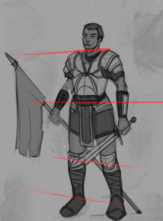
The latest figure's upper half is twisting to the left, while the bottom looks like it's faced straight on.
If there's a twist to the body, the angle of the twist should be titled at a vanishing point.
And the foot looks as if it's rendered if the camera is at the level of the foot.
I've adjusted the figure, having the horizon line near the waist level of the subject:

I admit it's not that accurate but I hope it drives my point home. Hope this helps, and don't hesitate to point out if what I said was confusing, or god forbid, wrong.
----
On to the critique:
The latest figure's upper half is twisting to the left, while the bottom looks like it's faced straight on.
If there's a twist to the body, the angle of the twist should be titled at a vanishing point.
And the foot looks as if it's rendered if the camera is at the level of the foot.
I've adjusted the figure, having the horizon line near the waist level of the subject:

I admit it's not that accurate but I hope it drives my point home. Hope this helps, and don't hesitate to point out if what I said was confusing, or god forbid, wrong.
If you are reading this, I most likely just gave you a crappy crit! What I'm basically trying to say is, don't give up!
----
IG: @thatpuddinhead
----
IG: @thatpuddinhead


