10-07-2016, 06:46 PM
Hope you guys don't mind, I did a couple things to try and show some suggestions:
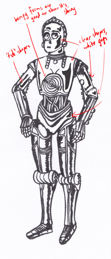
Ooloriel You got the right idea with the metal but just did too much of the black bar, I put a couple suggestions on top - good rule of thumb is to make sure there is gaps of white around the black reflection part, use it sparingly, and make it a clear shape (I go for 'tick' like shapes quite often). Here is a super quick thing to show what I mean:

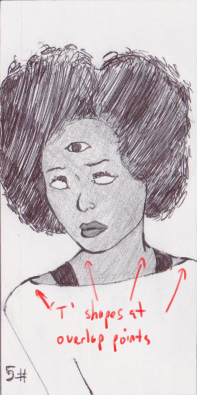
Kayo Kid Here is a straightforward approach for adding some depth to your drawings - wherever there is a 'T' shaped overlap of lines, make the T part thicker:

Ooloriel You got the right idea with the metal but just did too much of the black bar, I put a couple suggestions on top - good rule of thumb is to make sure there is gaps of white around the black reflection part, use it sparingly, and make it a clear shape (I go for 'tick' like shapes quite often). Here is a super quick thing to show what I mean:

Kayo Kid Here is a straightforward approach for adding some depth to your drawings - wherever there is a 'T' shaped overlap of lines, make the T part thicker:


