11-10-2016, 09:47 PM
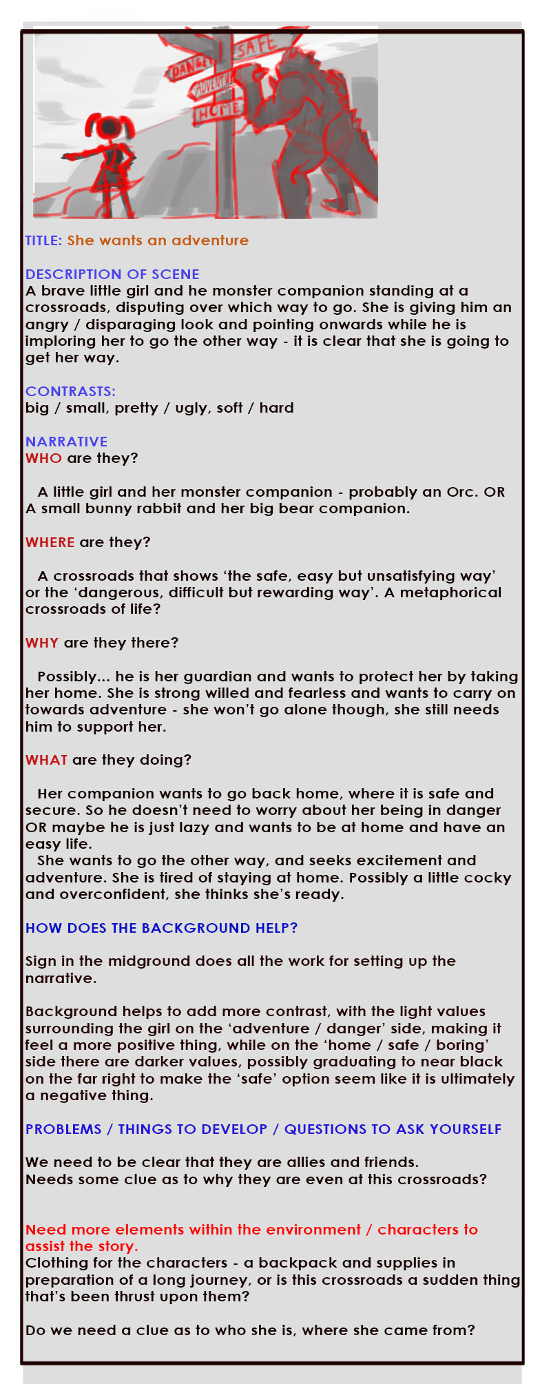
Thumbnailed some ideas, not for composition, just to brainstorm a concept (although some of the comps I quite like). I wrote a lot because it's quicker to write than to draw and the ideas kind of flow out and solidify when I'm writing.
I think I have a tendency to make my themes too complicated and subtle so this time I want to make my idea so clear and simple, and really smack the viewer over the head with it so they really can't miss it, and then put a lot of energy into the facial expressions and composition to make it beautiful and interesting. That's my goal anyway!
Not sure if I should bash out another few sets of these concepts, I did 6 so far, these are the better ones. I really like the 'she wants an adventure' one and the 'giant and the acrobat' one. But still not sure if I should keep digging.
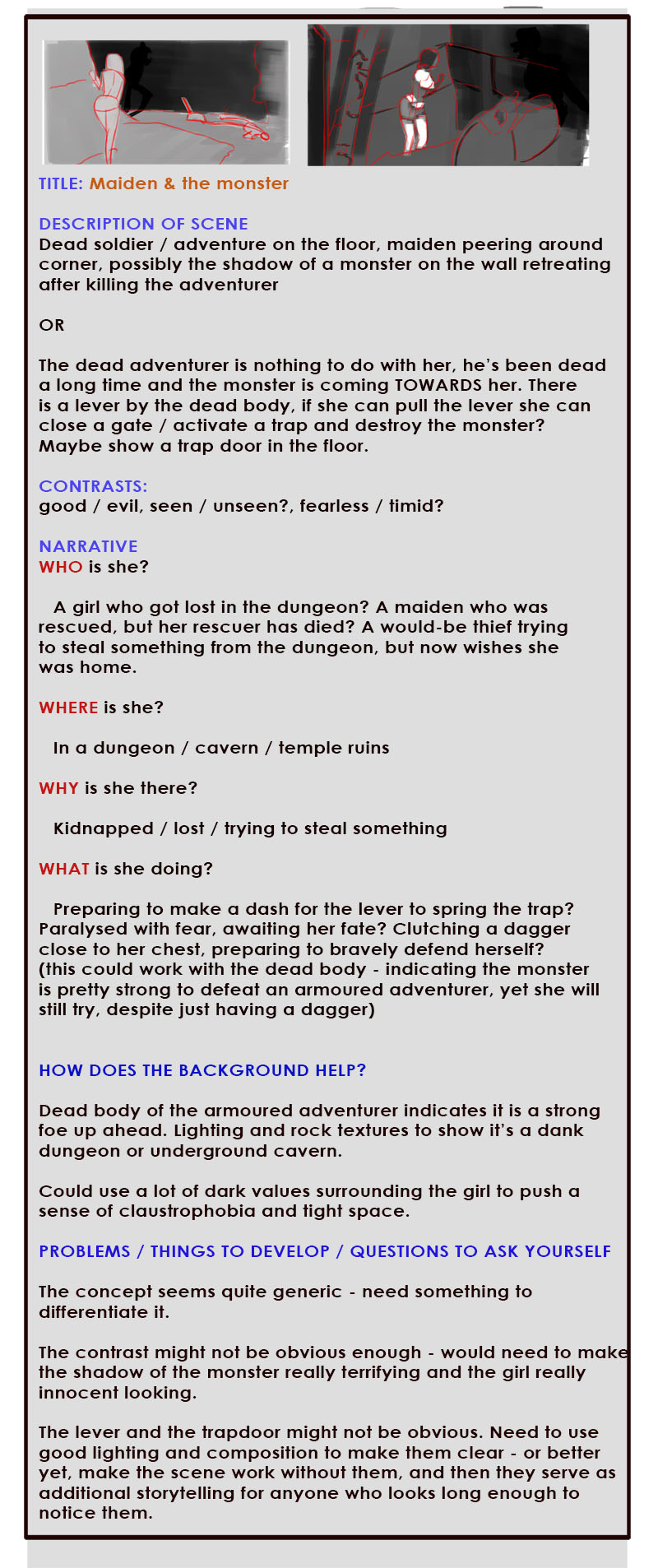
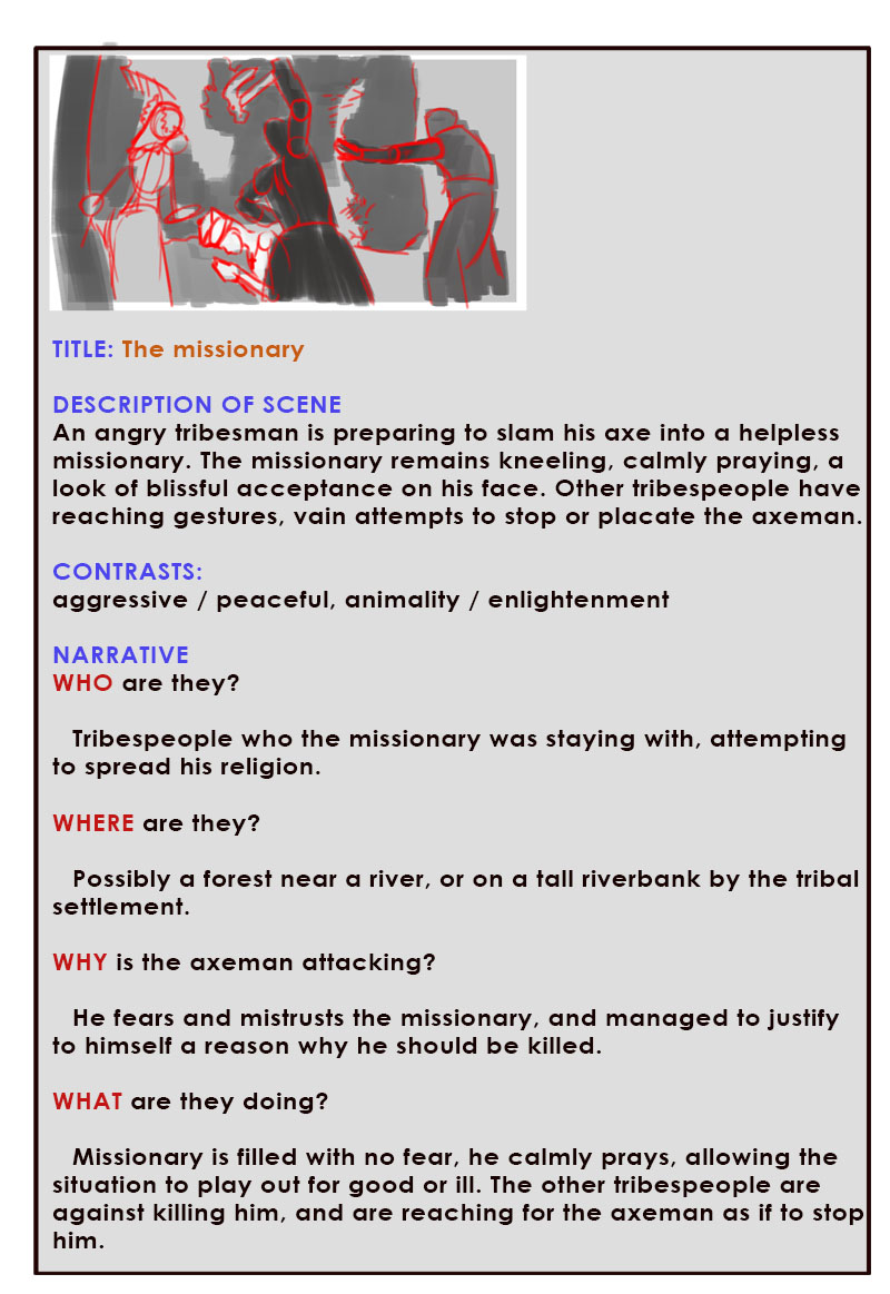
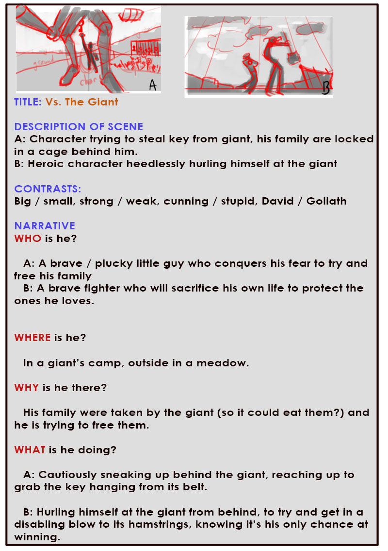
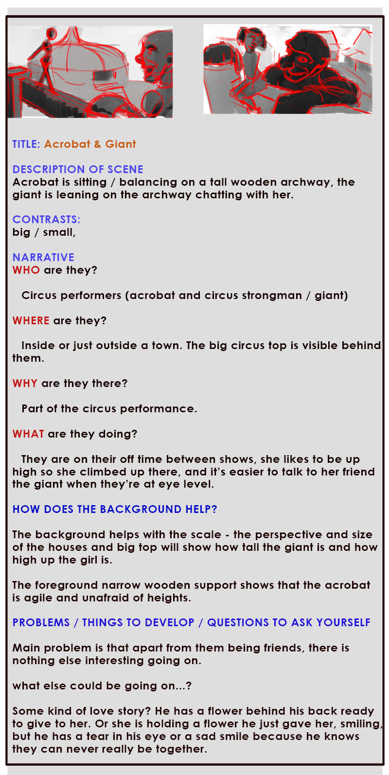
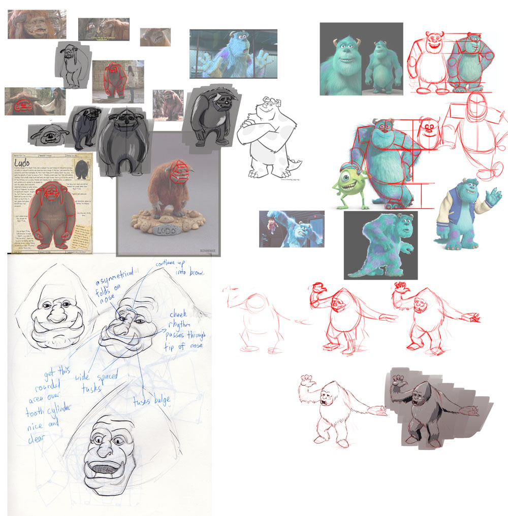
Then just sketching around and looking at design inspiration for a monster for the 'she wants adventure' idea - but might try to bash out some more idea thumbnails first before going further. What do you guys think? Any of these ideas feel strong enough yet? If you read all the ideas, sorry for taking your time! and thanks for reading!
I think I have a tendency to make my themes too complicated and subtle so this time I want to make my idea so clear and simple, and really smack the viewer over the head with it so they really can't miss it, and then put a lot of energy into the facial expressions and composition to make it beautiful and interesting. That's my goal anyway!
Not sure if I should bash out another few sets of these concepts, I did 6 so far, these are the better ones. I really like the 'she wants an adventure' one and the 'giant and the acrobat' one. But still not sure if I should keep digging.


Then just sketching around and looking at design inspiration for a monster for the 'she wants adventure' idea - but might try to bash out some more idea thumbnails first before going further. What do you guys think? Any of these ideas feel strong enough yet? If you read all the ideas, sorry for taking your time! and thanks for reading!


