08-27-2012, 05:30 PM
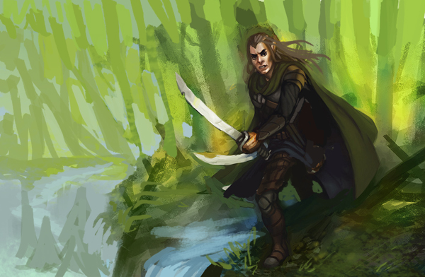
Good stuff here, I really like the composition on the first b&w piece on this page. What I would try to do now is explore the ways to put characters somewhere other than middle of the page (like you did in that b&w). It will allow you to tell more story. I really like the colors on the elf guy but it needs more movement, his arms are parallel. So, here is what I meant, roughly, i hope it makes sense


