02-21-2019, 06:39 AM
Hey Beau, good stuff here!
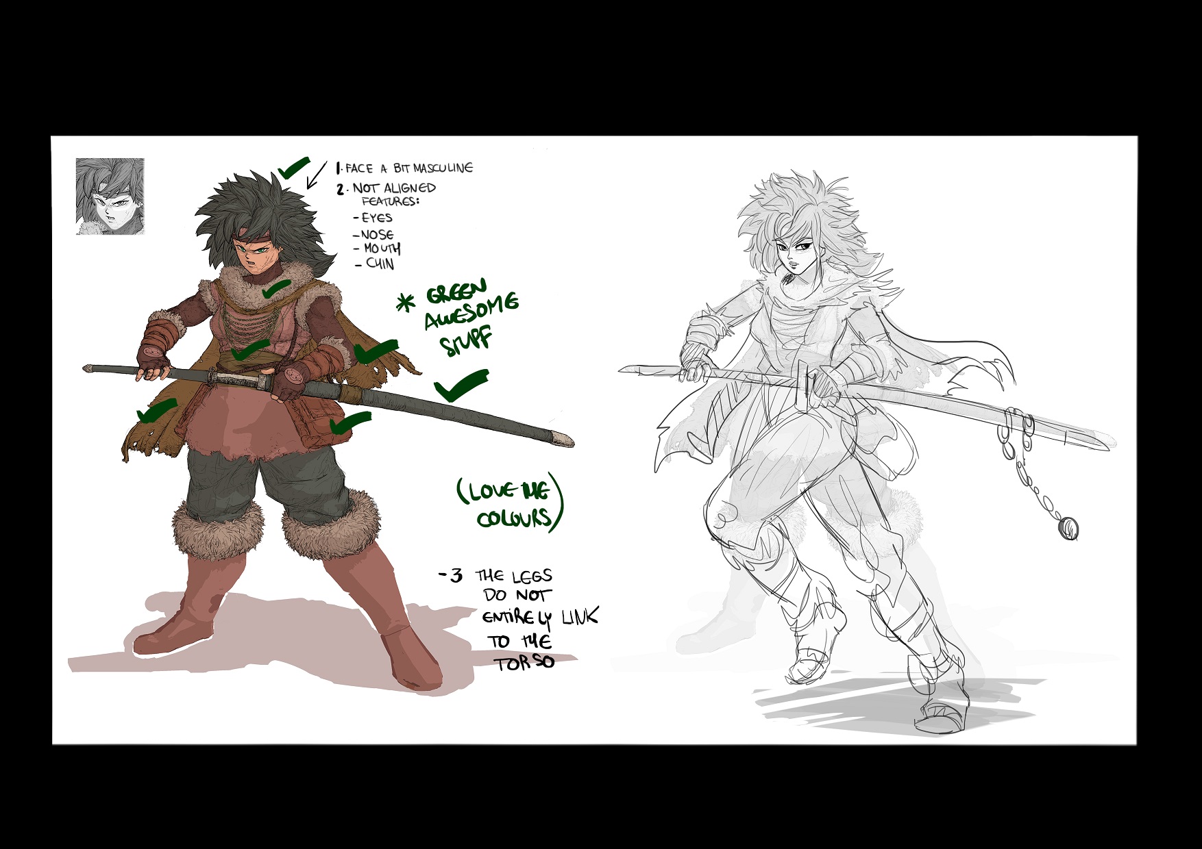
I really like your barbarian girl concept, sensing the Akira Toriyama vibe haha.
The painting shines, the colour palette connects very well and the low saturation aesthetic is a very clever solution.
Some portions of the drawing are really captivating; right arm and hand, the sword, the collar fur, the cape, the hair and the way you detail the fur. Those are very rich spots for your drawing´s favour.
Now, what i see that breaks that harmony is the face, which is one of the most highlighted parts of every illustration/ concept that has characters in it.
The features are drawed well but the problem is that they do not connect; the eyes seem not alligned, neither the mouth, nose and chin. I cannot touch exactly on what it is, the proportion, the alligment, i just feel that something is not entirely closing.
The maneirisms and porportions of the girl are a bit masculine, not sure if it was the goal.
Hope that you don´t mind that i made a luce drawover to illustrate some of the points.
Designwise, a few things can increase the readability;
1. the sword base could be bigger for readability sake
2. something like an accessory for the sword to give her some personality
3. Give more shape and personality for the fur.
4. Give more form to the lef, even though covered with large pants and fur boots.

Just my two cents man but anyway, fantastic work!
I really like your barbarian girl concept, sensing the Akira Toriyama vibe haha.
The painting shines, the colour palette connects very well and the low saturation aesthetic is a very clever solution.
Some portions of the drawing are really captivating; right arm and hand, the sword, the collar fur, the cape, the hair and the way you detail the fur. Those are very rich spots for your drawing´s favour.
Now, what i see that breaks that harmony is the face, which is one of the most highlighted parts of every illustration/ concept that has characters in it.
The features are drawed well but the problem is that they do not connect; the eyes seem not alligned, neither the mouth, nose and chin. I cannot touch exactly on what it is, the proportion, the alligment, i just feel that something is not entirely closing.
The maneirisms and porportions of the girl are a bit masculine, not sure if it was the goal.
Hope that you don´t mind that i made a luce drawover to illustrate some of the points.
Designwise, a few things can increase the readability;
1. the sword base could be bigger for readability sake
2. something like an accessory for the sword to give her some personality
3. Give more shape and personality for the fur.
4. Give more form to the lef, even though covered with large pants and fur boots.

Just my two cents man but anyway, fantastic work!


