06-29-2020, 12:09 AM
Very neat style! I agree that it reminds me of classic art from "back in the days" on Elfwood and earlier Deviantart. Love it! 
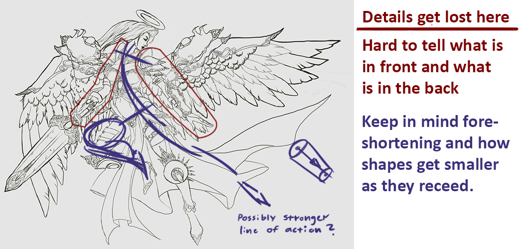
I have some criticism on one of your images. The main problem i see is that you have put so many details in that its hard to read the shapes and what is supposed to be in front and what is in the back. Some studies of lineweight and balancing details with empty areas would probably benefit you.

Hope to see much more stuff from you soon! Keep posting! :)

I have some criticism on one of your images. The main problem i see is that you have put so many details in that its hard to read the shapes and what is supposed to be in front and what is in the back. Some studies of lineweight and balancing details with empty areas would probably benefit you.

Hope to see much more stuff from you soon! Keep posting! :)


