08-25-2020, 07:19 AM
(08-21-2020, 06:45 PM)Zorrentos Wrote: A clear improvement over the previous pages.
Here are some useful links and reading that may help you. I especially recommend the second link (scroll down a bit to get to the bit about composition and placement)
Thanks! I went though a part of it, but it was so much, that it can not be done in one session. I will go through more of it in the future.
I read the part about the line of action, I get the impression, that its not always good to have a strong line of action, it seems to me the stronger the line of action, the cartoonier the figure looks.
But its definitely something to experiment with.
___
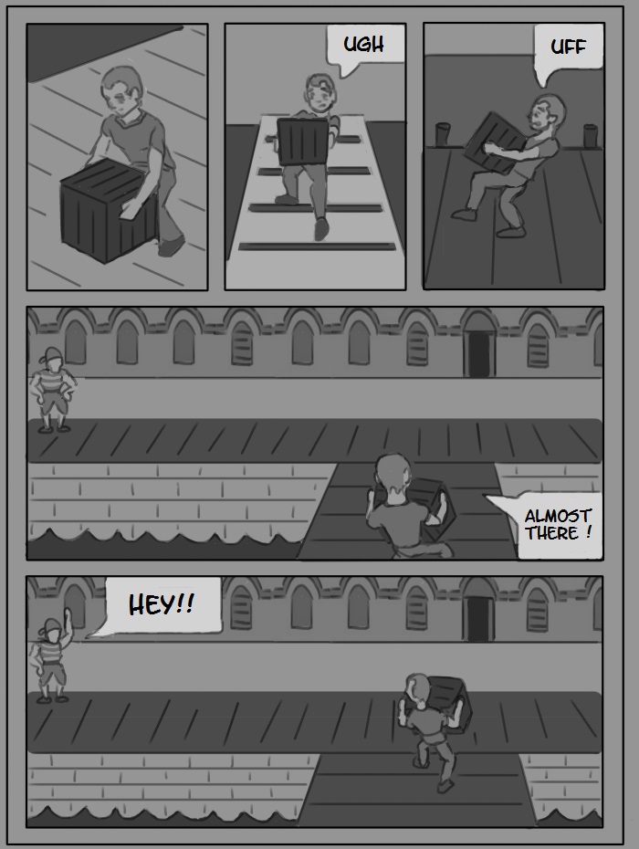
Here we have the next page.
It has no improved techniques like leading the eye, not even good camera-placement, but I want to push the story a little bit, until I finally finish chapter 1 (which means page 20-30). I already lined up several pages in not-so-advanced-style.
Page 11 Version 1

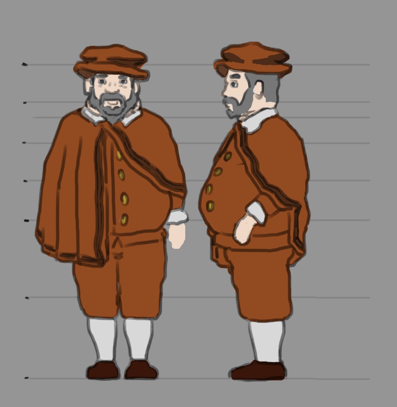
Oh yeah, and here a little concept of the merchant.

on DeviantArt


