11-10-2020, 03:32 AM
Everything is looking really good, but the Zelda piece is turning out amazing! I really love how well you are able to do the perspective by now! The comic pages must be paying off in terms of mileage! :)
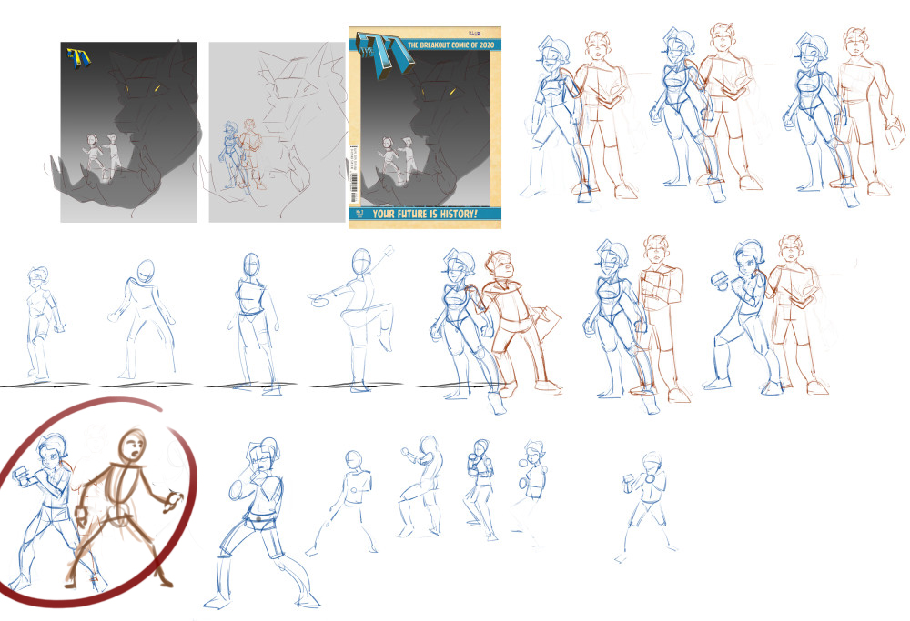
As for the werewolf cover. It's hard to read the shapes because the size is so small, but the poses should IMO have a feeling of "preparing to defend themselves" since the werewolf is portrayed as an ominous, symbolic danger in this cover. I made a small overpaint of the approach I would take:

Keep up the good work and keep posting!
As for the werewolf cover. It's hard to read the shapes because the size is so small, but the poses should IMO have a feeling of "preparing to defend themselves" since the werewolf is portrayed as an ominous, symbolic danger in this cover. I made a small overpaint of the approach I would take:

Keep up the good work and keep posting!


