11-11-2020, 01:21 AM
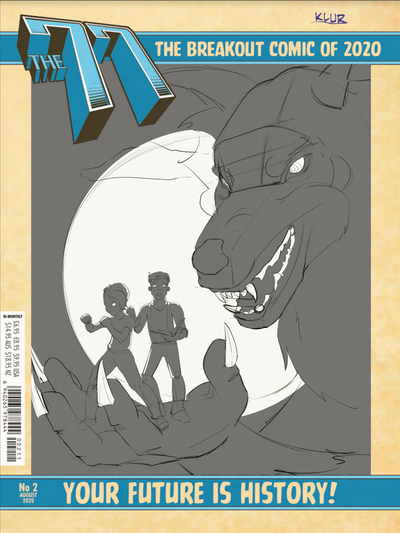
Zorrentos Thanks for the comment/feedback/paintover! I should've posted more progress on that cover since I was further along, but pretty much went the route you were suggesting anyway.
The second character behind her is more subdued to try and be more comedic, like he's doing a double take type of thing while she's 'ready for danger' but totally facing the wrong way.
I cropped out the werewolf a bit, since I thought the character's could be a bit bigger on the page. Making them smaller and the werewolf bigger would make things more oppressive/threatening but I want to show the characters too.
I pretty much hate it at this point >.< feels like there's a ton of opportunity I'm missing out on but not really sure where to focus. I like the character poses, I dislike the werewolf, it feels to me like no improvement on the thumbnail, even that it's worse now I added detail. I like the giant moon/circle shape.
Desperately looking for feedback if anyone has any suggestions ^^


