11-28-2020, 01:36 AM
Xelf Thanks man! means a lot ^^
Artloader I hadn't come across him before but I'm an instant fan now. Exploring a range of rendering/colouring styles I guess then is the best way and our personal style should kind of appear on it's own I guess? That solid drawing technique is the most important though, as professional painters are always saying!
CGMythology Happy to hear that my work has some kind of recognisable style to it! I guess it's like seeing photo's of family who look a bit like you, you can never see the similarities yourself. I should definitely finish that zelda piece, I have really bad stamina with personal work... I feel happy about something for a while then get filled with doubt and move on to something else.
Been busy studying and working on the comic, one more batch of 6 pages to finish then a break from it while we figure out the script for the next case.
Been continuing with Wouter Tulp's Digital Painting Workout. They're daily 30 minute painting exercises, although when he's finished I continue for a bit, maybe an hour max. Painting along with him is a bit of a struggle, trying to watch him, look closely at the reference and paint myself, so I definitely need to do some of the exercises again from my own reference. It's really helping me get my head around colour and value tho.
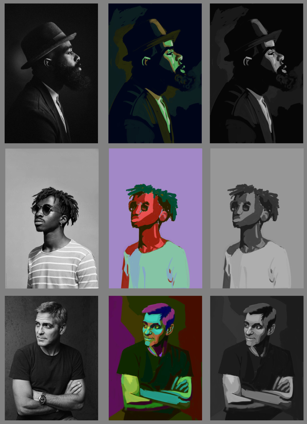
The goal for this one was to paint the correct values, but using random, highly saturated colours. The ones on the right are converted to greyscale to see how close I got. It's was a real brain twister but I think a really good exercise:
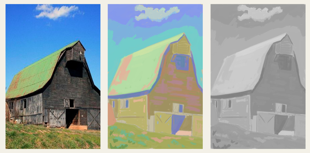
This one is using colours to replicate the value range, but shifting it to a high key. Converted to greyscale at the end to check:
Same as above but into a low key. This one doesn't feel as successful, needed to go a little brighter maybe in the roof and the bright spots on the floor.
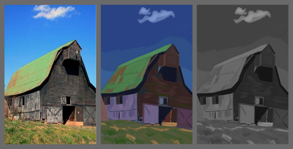
This one was to paint the foreground character with a full value range, everything else in a high key:
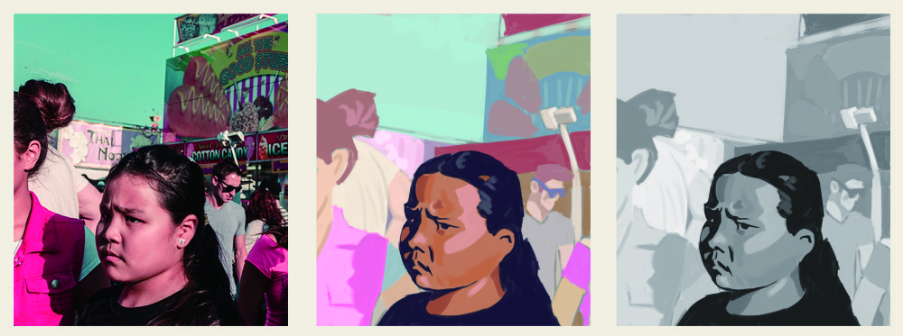
Finally painted the focal point with full range values and high saturation, then fade it off into a high key/low saturation in the surrounding areas.
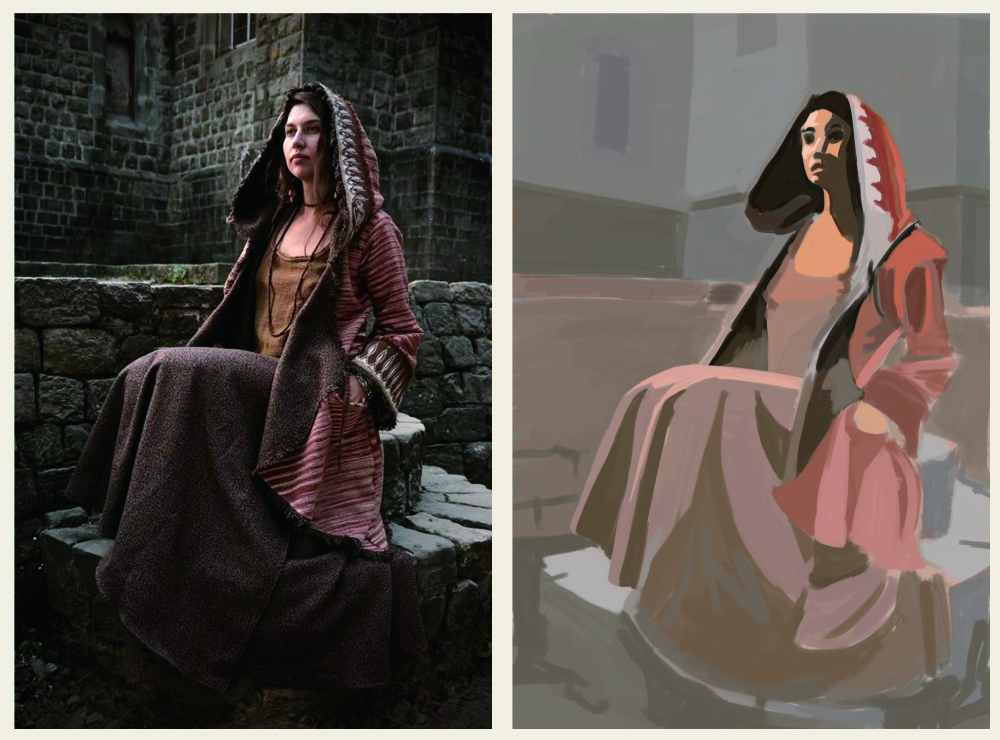
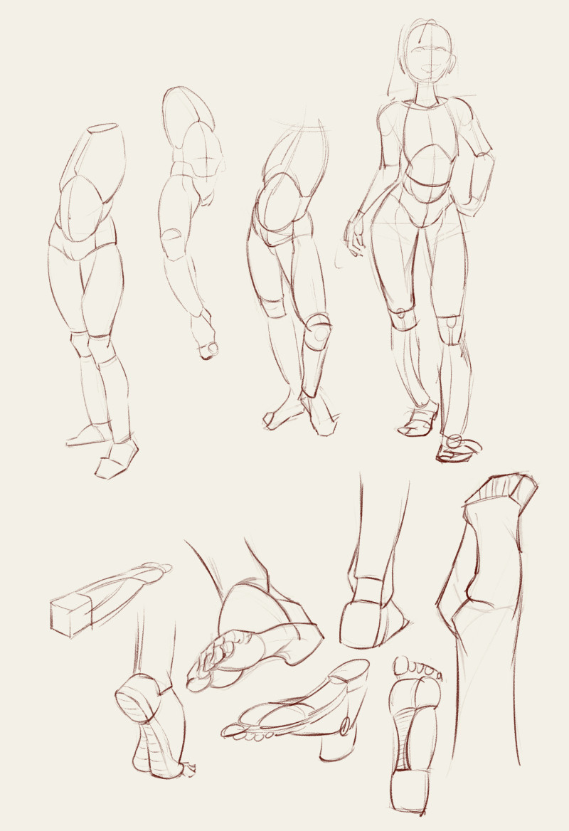
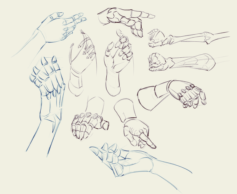
Some warmup drawings from pinterest feed:
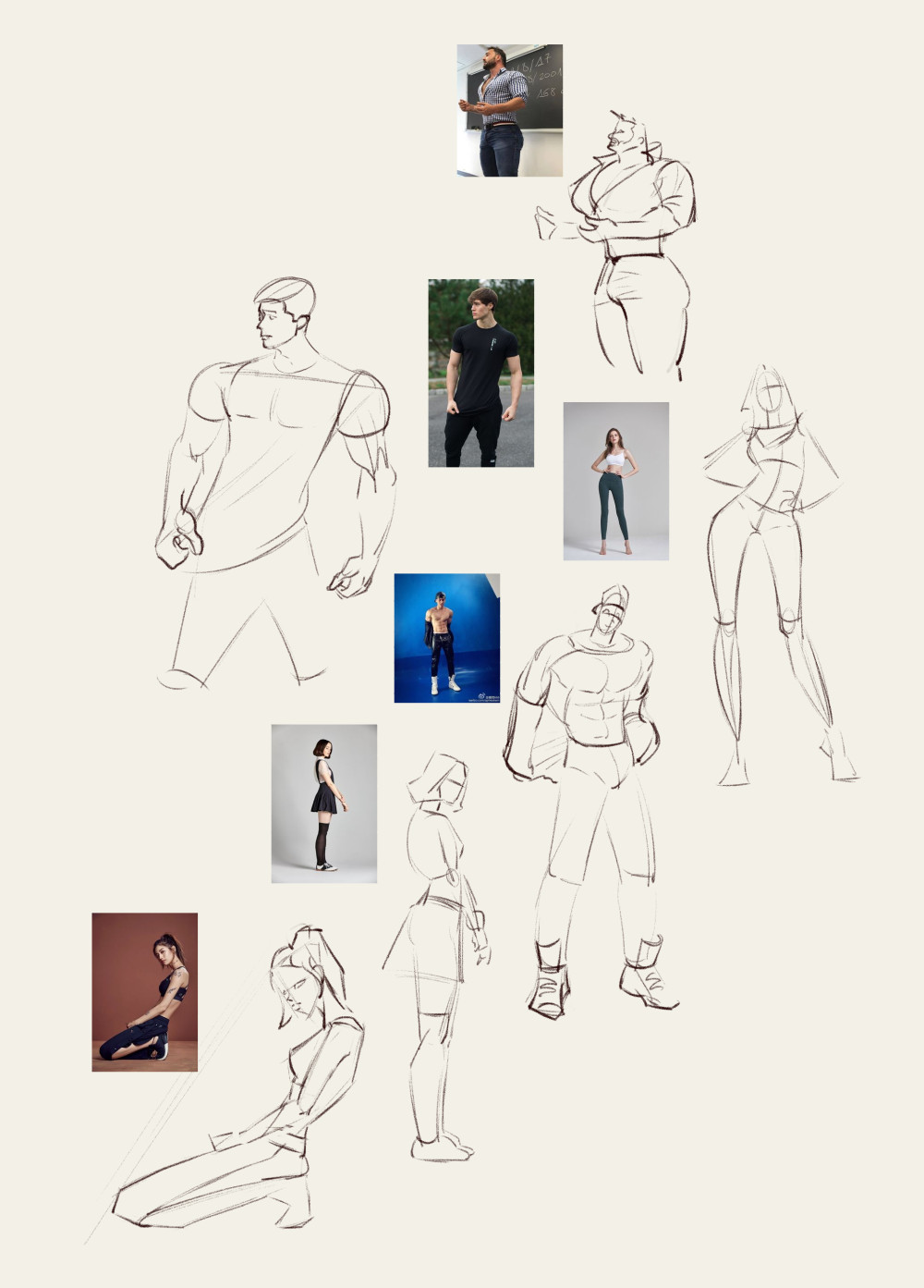
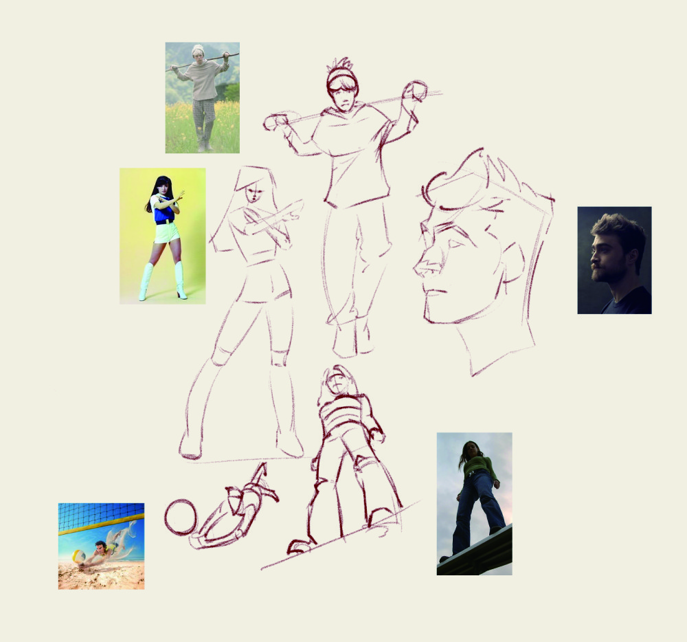
and some various anatomy studies. I bought a few books by Michel Lauricella who has really nice simplified anatomy forms:


Artloader I hadn't come across him before but I'm an instant fan now. Exploring a range of rendering/colouring styles I guess then is the best way and our personal style should kind of appear on it's own I guess? That solid drawing technique is the most important though, as professional painters are always saying!
CGMythology Happy to hear that my work has some kind of recognisable style to it! I guess it's like seeing photo's of family who look a bit like you, you can never see the similarities yourself. I should definitely finish that zelda piece, I have really bad stamina with personal work... I feel happy about something for a while then get filled with doubt and move on to something else.
Been busy studying and working on the comic, one more batch of 6 pages to finish then a break from it while we figure out the script for the next case.
Been continuing with Wouter Tulp's Digital Painting Workout. They're daily 30 minute painting exercises, although when he's finished I continue for a bit, maybe an hour max. Painting along with him is a bit of a struggle, trying to watch him, look closely at the reference and paint myself, so I definitely need to do some of the exercises again from my own reference. It's really helping me get my head around colour and value tho.
The goal for this one was to paint the correct values, but using random, highly saturated colours. The ones on the right are converted to greyscale to see how close I got. It's was a real brain twister but I think a really good exercise:

This one is using colours to replicate the value range, but shifting it to a high key. Converted to greyscale at the end to check:

Same as above but into a low key. This one doesn't feel as successful, needed to go a little brighter maybe in the roof and the bright spots on the floor.

This one was to paint the foreground character with a full value range, everything else in a high key:

Finally painted the focal point with full range values and high saturation, then fade it off into a high key/low saturation in the surrounding areas.

Some warmup drawings from pinterest feed:


and some various anatomy studies. I bought a few books by Michel Lauricella who has really nice simplified anatomy forms:
