12-08-2020, 03:38 AM
Skeffin Thanks! I'm really aiming for the simplified approach, glad it's showing through!
Darktiste I made them tiny on purpose. I tend to draw heads too big usually I think, so drawing them small sometimes, I think, should help.
Some recent studies and practice things, my main time is put into the comic which I'll share here too when it's finished!
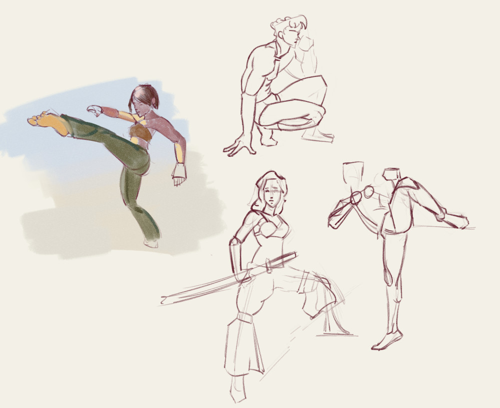
drawing warmup:
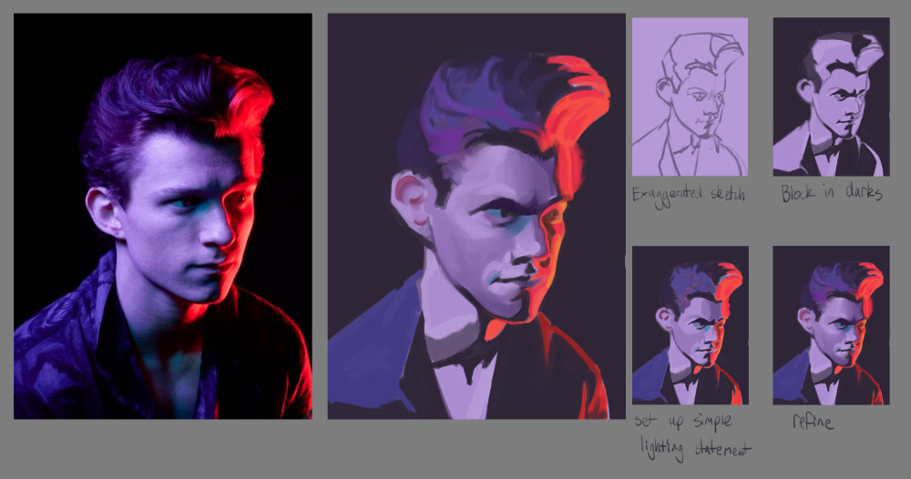
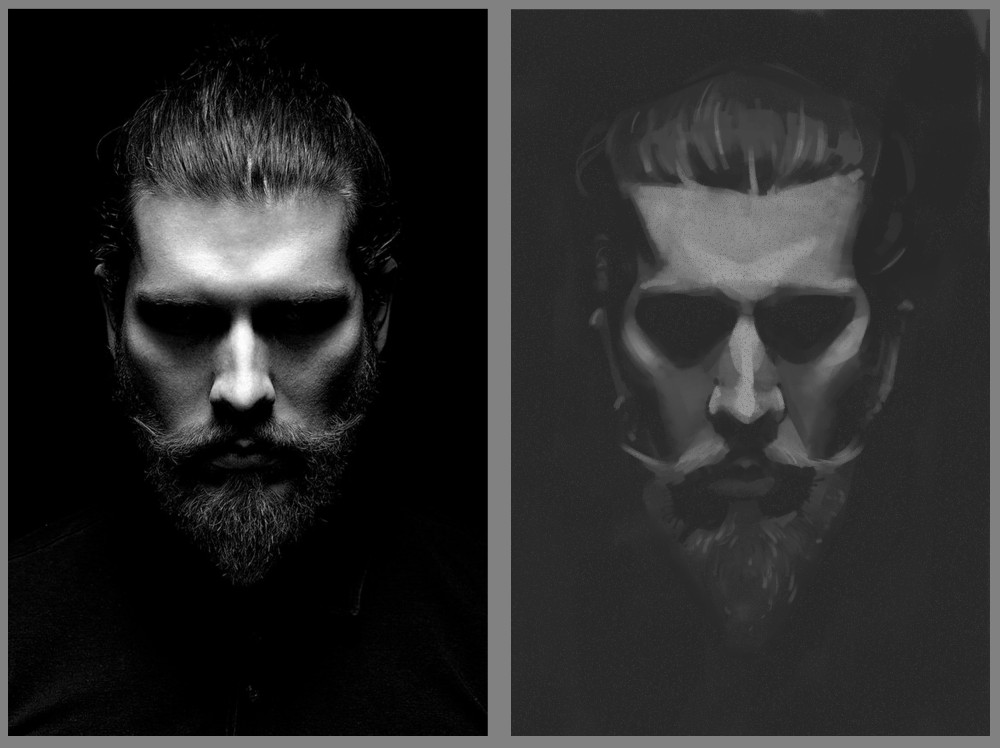
Digital Painting Workout exercise painting coloured light:
light from two sides:
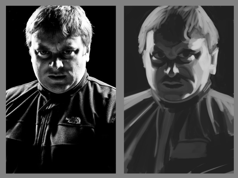
light from above:
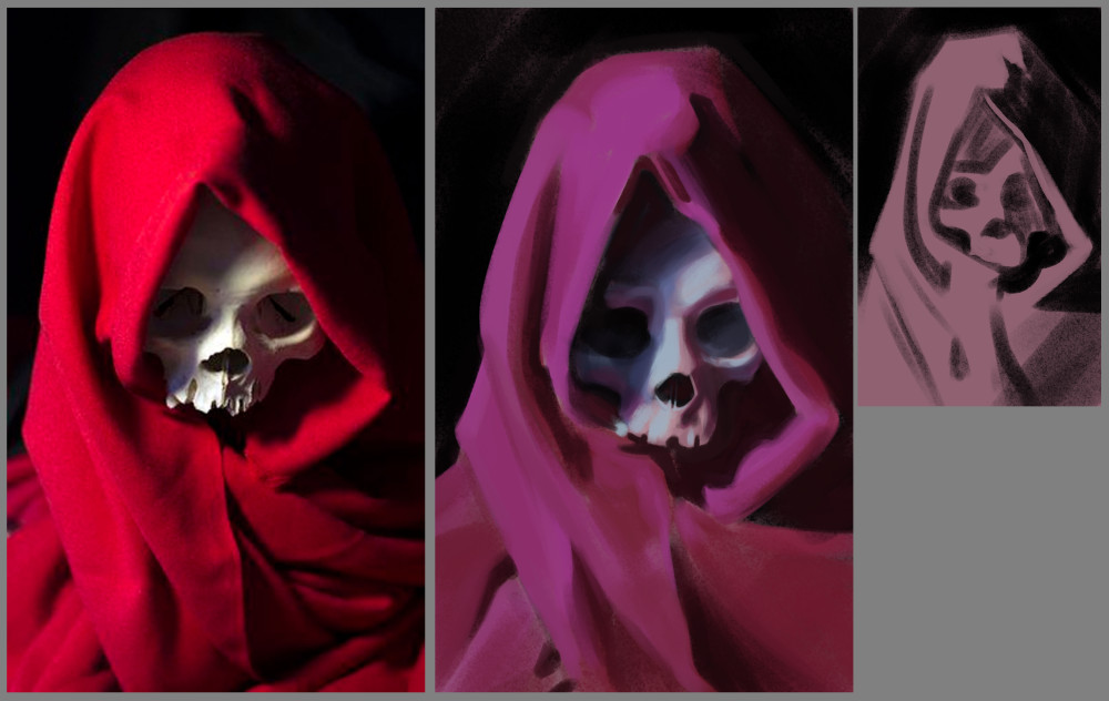
this exercise was to paint the reference as if it was a cool light instead of a warm one, so the cloth goes towards purple and shadows are warm instead of cool and reflected light changes. I felt mostly happy with this one, except for the shadows on the image right side of the skull, couldn't quite get the values/reflected light colour to work as I wanted.
personal studies to get better painting skin:
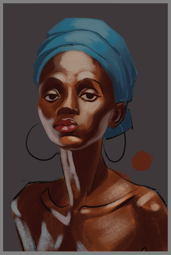
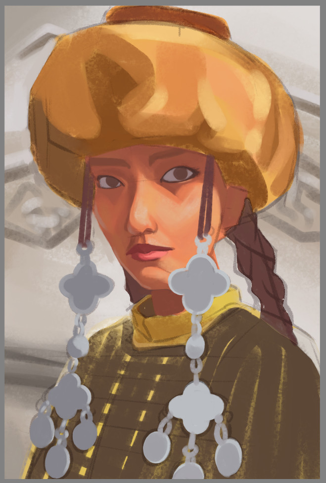
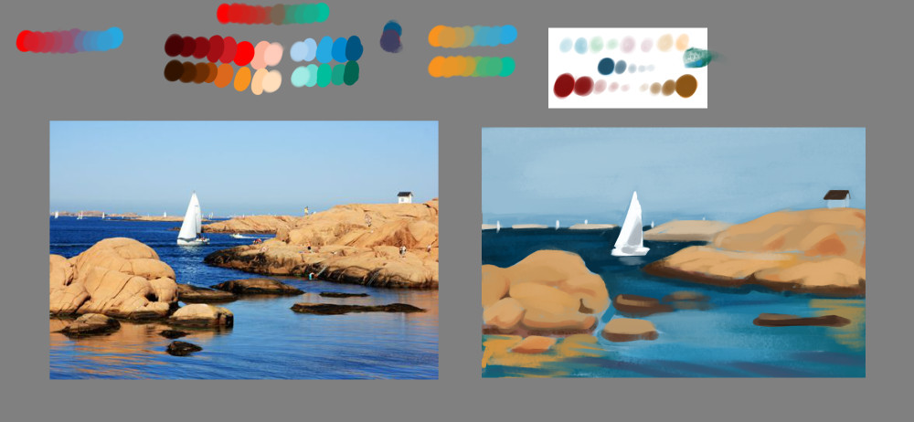
Another exercise. We use a limited palette and mix them on that white rectangle like it was traditional paint. We are allowed to add black and white to any colour too to raise/lower value and reduce saturation. This first one I did with the video, but got all mixed up and the colour palette was way too broad and I don't think it's very harmonious:
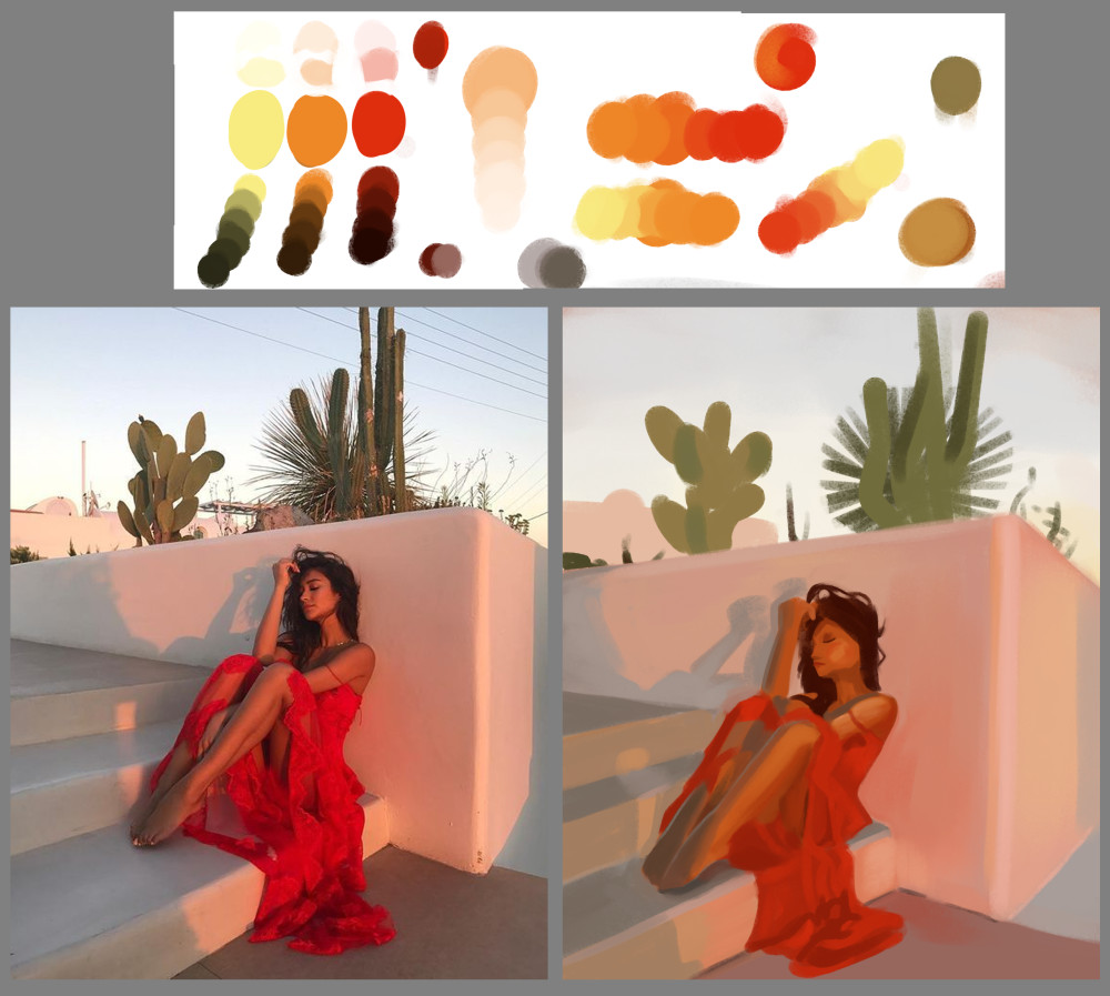
Tried another one on my own picking three starting colours. Choosing red yellow and orange was probably not the best choice, should've had a cooler colour in there but it was nice to paint without worrying about what colour to pick next, just trying out different mixes of my starting colours. I might paint like this for a while to try and get an appreciation of some limited colours instead of just nudging things around on the hue/sat/brightness sliders like usual. The shadows on the woman are not very successful, but on the whole there is definitely colour harmony across the image I think.
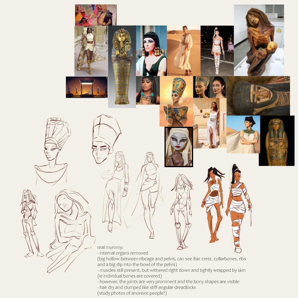
Some initial exploring sketches for one of the next villain characters for our comic, an egyptian mummy/femme fatale type of villain. Will need to draw her in human form in a flashback sequence, as well as Cleopatra, and mummy form for the main action:

Darktiste I made them tiny on purpose. I tend to draw heads too big usually I think, so drawing them small sometimes, I think, should help.
Some recent studies and practice things, my main time is put into the comic which I'll share here too when it's finished!
drawing warmup:

Digital Painting Workout exercise painting coloured light:

light from two sides:

light from above:

this exercise was to paint the reference as if it was a cool light instead of a warm one, so the cloth goes towards purple and shadows are warm instead of cool and reflected light changes. I felt mostly happy with this one, except for the shadows on the image right side of the skull, couldn't quite get the values/reflected light colour to work as I wanted.

personal studies to get better painting skin:


Another exercise. We use a limited palette and mix them on that white rectangle like it was traditional paint. We are allowed to add black and white to any colour too to raise/lower value and reduce saturation. This first one I did with the video, but got all mixed up and the colour palette was way too broad and I don't think it's very harmonious:

Tried another one on my own picking three starting colours. Choosing red yellow and orange was probably not the best choice, should've had a cooler colour in there but it was nice to paint without worrying about what colour to pick next, just trying out different mixes of my starting colours. I might paint like this for a while to try and get an appreciation of some limited colours instead of just nudging things around on the hue/sat/brightness sliders like usual. The shadows on the woman are not very successful, but on the whole there is definitely colour harmony across the image I think.

Some initial exploring sketches for one of the next villain characters for our comic, an egyptian mummy/femme fatale type of villain. Will need to draw her in human form in a flashback sequence, as well as Cleopatra, and mummy form for the main action:
