02-05-2021, 05:00 PM
Welcome to CD Jephyr! You have some very neat stuff here! I really like to see old-school traditional artworks on CD. It's a breath of fresh air from all the CGI-stuff we all produce.
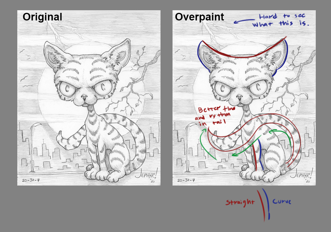
I think you got some solid pieces in your portfolio, however, there are some stuff I think you could improve on. I did a small overpaint/suggestion of your cat piece that I think showcase what I have in mind.
You have a sort of "lumpiness" in your artwork that I think pulls down the whole impression. Basically, you don't seem to keep in mind the rhythm and flow in some of your shapes. For example, in the cat's legs, we have two curves facing each other on separate sides of the form. A curve looks better against a straight.

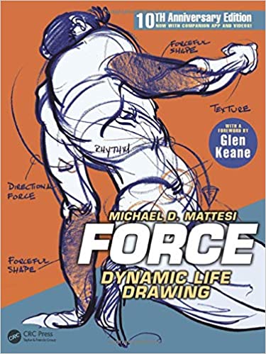
Here's a good book on the subject:
Hope this small suggestion helps! Keep up the good work! :)
I think you got some solid pieces in your portfolio, however, there are some stuff I think you could improve on. I did a small overpaint/suggestion of your cat piece that I think showcase what I have in mind.
You have a sort of "lumpiness" in your artwork that I think pulls down the whole impression. Basically, you don't seem to keep in mind the rhythm and flow in some of your shapes. For example, in the cat's legs, we have two curves facing each other on separate sides of the form. A curve looks better against a straight.

Here's a good book on the subject:

Hope this small suggestion helps! Keep up the good work! :)


