02-21-2021, 03:00 AM
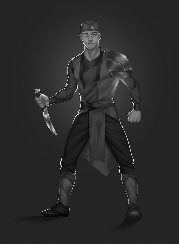
Welcome! Sorry I saw this a few days ago and figured someone else would comment. It looks quite good, well drawn and cleanly painted. I only think there are certain elements to it that make it look flat and cut out. The rim light is one of them, because it appears around almost the whole contour and obscures key overlaps that indicate the forms being round. So it works to communicate a backlit character, but it's not helping it to look three dimensional even though it's drawn pretty nice. It's not really that necessary for a simple character design drawing anyway. I would just stick to a front lighting, and then change the background to something that makes the character stand out from it.
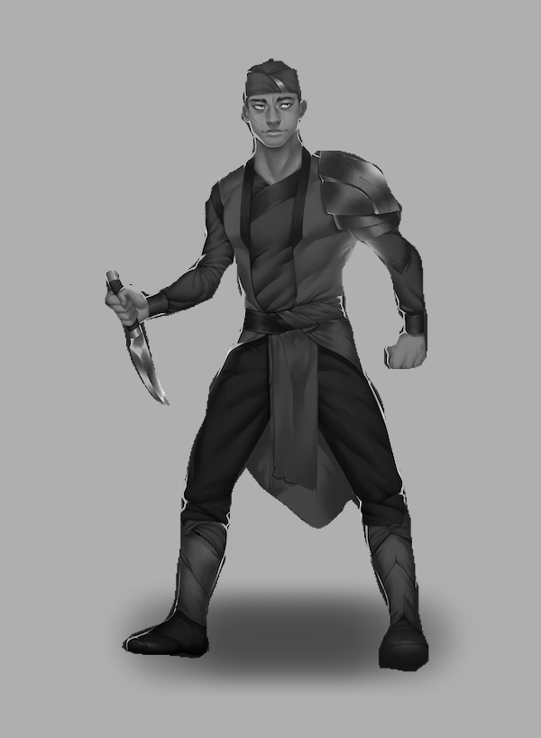
Even with the contre jour, rimlight situation, the blue on blue doesn't really work that well. If you put it in black and white we still barely get a separation from the background. If you change it to a light background I think the read will be generally a lot better.


There are other little things that contribute to the flatness. Like I feel like some things, the shoulder pauldron, and the knife and that arm are drawn in a way that avoids foreshortening them in perspective. Like it feels like things tend a little bit to want to be exactly at the side of his body, and seen in profile if possible, instead of going forward or back in space. I know it's stylized so you can ignore that if you don't feel like it applies. But I do get a little sense of the "flyswatted" look to the pose, if that makes sense.
Even with the contre jour, rimlight situation, the blue on blue doesn't really work that well. If you put it in black and white we still barely get a separation from the background. If you change it to a light background I think the read will be generally a lot better.


There are other little things that contribute to the flatness. Like I feel like some things, the shoulder pauldron, and the knife and that arm are drawn in a way that avoids foreshortening them in perspective. Like it feels like things tend a little bit to want to be exactly at the side of his body, and seen in profile if possible, instead of going forward or back in space. I know it's stylized so you can ignore that if you don't feel like it applies. But I do get a little sense of the "flyswatted" look to the pose, if that makes sense.


