04-17-2021, 08:10 AM
Oooh, the latest illustration is very card-like. Nice job! You sketches are pretty clean too.
Regarding the WIP I have a few suggestions in addition to the excellent ones above if you don't mind. They're highly dependent on style so please check if they hold true for your target style.
This turned out long so I broke it into topics in hopes of making it easier to digest.
Saturation
You've been struggling with saturation and values, right? I feel that modifying the way you start coloring + looking at hues and values with a different mindset might help.
You're starting from super saturated base colors. Taking a subtractive approach—removing saturation—tends to be harder than taking an additive one. You know at some level that you can use colors to drag the eyes to some detail, thus the tendency is to pile more and more saturated colors on top of the base to do so. Removing them on the other hand is unnatural.
This makes starting from a more toned down base a good strategy to deal with saturation when you can't fully control it yet. If the piece looks too lifeless in a way you don't know how to proceed then you can use some gradients or quick saturated brushstrokes to breath some extra color in the base. Just don't use too much of it right away, be picky.
Expanding on this, think of saturation as a limited resource. You can use it to bring focus to some area in the same manner you can use value extremes (brightest and darkest) and level of detail. So the idea here is not to think as saturation as something that just happens, but as quantifiable thing you can use strategically towards a goal. Add it progressively and watch out to not use too much of this precious resource to the point it loses impact.
Values
You're strong in your line work. You should rely on your pretty lines ofc, but I suspect they're playing an outsized role in your choice of values without you noticing. You tend to use the darkest values were lines used to be, including inside an object (eg shirt folds) instead of using the surface, shape and light as guidance. Think of values of something dependent on the coordinates and angle of that area, not outlines.
That's not to say you can't use outlines in a painting, you can and they'll look neat. The trick is to do it deliberately.
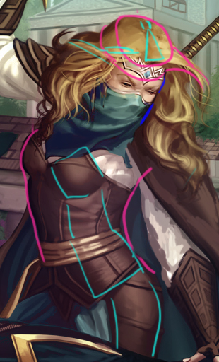
Pink - Object silhouette. As a hacky rule of thumb you'll see a bigger variation in values there because you got bigger plane changes happening in the object as a solid mass than in its individual parts like every clump of hair.
Cyan - Inner volumes. You'll see subtler value changes there: These areas don't advance or retreat too much into the space nor they are under radically different lighting.
Dark Blue - Outline. A touch of style. This is a reserved darker value to make an area of interest pop, a bit like if someone turned SSAO for this area.
Another detail worth mentioning is how I didn't outline entire "inner components" such as her mask evenly. Even outlines make all sense when working with lines but aren't realistic when you're throwing volume in; perspective wouldn't let you see their entire edges in an even thickness.
Speaking of outlines, there's also the negative space outline to play with:
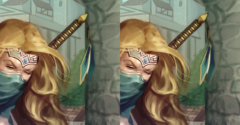
I have no idea of the formal term for it and I'm too lazy to look it up, but the idea is to use a bit of negative space to outline things when you need a tiny degree of separation but not that much.
Hues
Another thing I noticed is that you tend to remain within the same narrow band of hues for each material. Hue walking (yes I just made this up) is a resource you can use to tie different objects to a same scene that you're not quite using. Right now your hue choice is guided by material x value: You use the same set for all objects of a given material then you group them by values, like all shadows of hair being redder, all halftones golden.
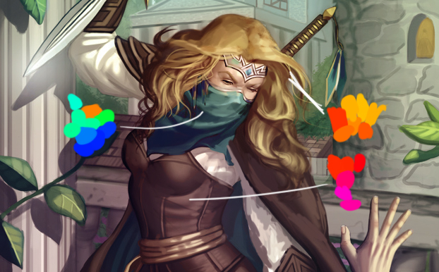
(color groups at 100% saturation)
You can make similar sets look wildly different by changing saturation and values; you can sneak extra crazy hues into a random material to make it more interesting to look at; but more importantly, you can tie hue variations to location instead of values.
A quick way to start playing with this is to use the radial gradient tool on a 5%-30% opaque layer in overlay or multiply modes. This is not simply a trick, this hue "contamination" of near materials has a touch of realism because it represents soft bounced light.
Wrapping up
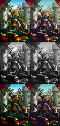
Here's the paintover in a single piece. Don't take the color choices as gospel, I was more concerned about their relationship than picking palettes.
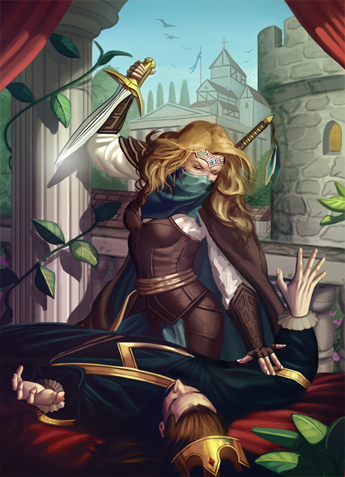
As a last tip try to modify the presentation of the illustration to debug it. Turning it into a thumbnail, switching to grayscale, or using PS filters that limit the palette/intensify outlines are all valid strategies to analyze the aspects mentioned above and the overall readability with fresh eyes.

Regarding the WIP I have a few suggestions in addition to the excellent ones above if you don't mind. They're highly dependent on style so please check if they hold true for your target style.
This turned out long so I broke it into topics in hopes of making it easier to digest.
Saturation
You've been struggling with saturation and values, right? I feel that modifying the way you start coloring + looking at hues and values with a different mindset might help.
You're starting from super saturated base colors. Taking a subtractive approach—removing saturation—tends to be harder than taking an additive one. You know at some level that you can use colors to drag the eyes to some detail, thus the tendency is to pile more and more saturated colors on top of the base to do so. Removing them on the other hand is unnatural.
This makes starting from a more toned down base a good strategy to deal with saturation when you can't fully control it yet. If the piece looks too lifeless in a way you don't know how to proceed then you can use some gradients or quick saturated brushstrokes to breath some extra color in the base. Just don't use too much of it right away, be picky.
Expanding on this, think of saturation as a limited resource. You can use it to bring focus to some area in the same manner you can use value extremes (brightest and darkest) and level of detail. So the idea here is not to think as saturation as something that just happens, but as quantifiable thing you can use strategically towards a goal. Add it progressively and watch out to not use too much of this precious resource to the point it loses impact.
Values
You're strong in your line work. You should rely on your pretty lines ofc, but I suspect they're playing an outsized role in your choice of values without you noticing. You tend to use the darkest values were lines used to be, including inside an object (eg shirt folds) instead of using the surface, shape and light as guidance. Think of values of something dependent on the coordinates and angle of that area, not outlines.
That's not to say you can't use outlines in a painting, you can and they'll look neat. The trick is to do it deliberately.

Pink - Object silhouette. As a hacky rule of thumb you'll see a bigger variation in values there because you got bigger plane changes happening in the object as a solid mass than in its individual parts like every clump of hair.
Cyan - Inner volumes. You'll see subtler value changes there: These areas don't advance or retreat too much into the space nor they are under radically different lighting.
Dark Blue - Outline. A touch of style. This is a reserved darker value to make an area of interest pop, a bit like if someone turned SSAO for this area.
Another detail worth mentioning is how I didn't outline entire "inner components" such as her mask evenly. Even outlines make all sense when working with lines but aren't realistic when you're throwing volume in; perspective wouldn't let you see their entire edges in an even thickness.
Speaking of outlines, there's also the negative space outline to play with:

I have no idea of the formal term for it and I'm too lazy to look it up, but the idea is to use a bit of negative space to outline things when you need a tiny degree of separation but not that much.
Hues
Another thing I noticed is that you tend to remain within the same narrow band of hues for each material. Hue walking (yes I just made this up) is a resource you can use to tie different objects to a same scene that you're not quite using. Right now your hue choice is guided by material x value: You use the same set for all objects of a given material then you group them by values, like all shadows of hair being redder, all halftones golden.

(color groups at 100% saturation)
You can make similar sets look wildly different by changing saturation and values; you can sneak extra crazy hues into a random material to make it more interesting to look at; but more importantly, you can tie hue variations to location instead of values.
A quick way to start playing with this is to use the radial gradient tool on a 5%-30% opaque layer in overlay or multiply modes. This is not simply a trick, this hue "contamination" of near materials has a touch of realism because it represents soft bounced light.
Wrapping up
Here's the paintover in a single piece. Don't take the color choices as gospel, I was more concerned about their relationship than picking palettes.

As a last tip try to modify the presentation of the illustration to debug it. Turning it into a thumbnail, switching to grayscale, or using PS filters that limit the palette/intensify outlines are all valid strategies to analyze the aspects mentioned above and the overall readability with fresh eyes.
