04-19-2021, 02:10 AM
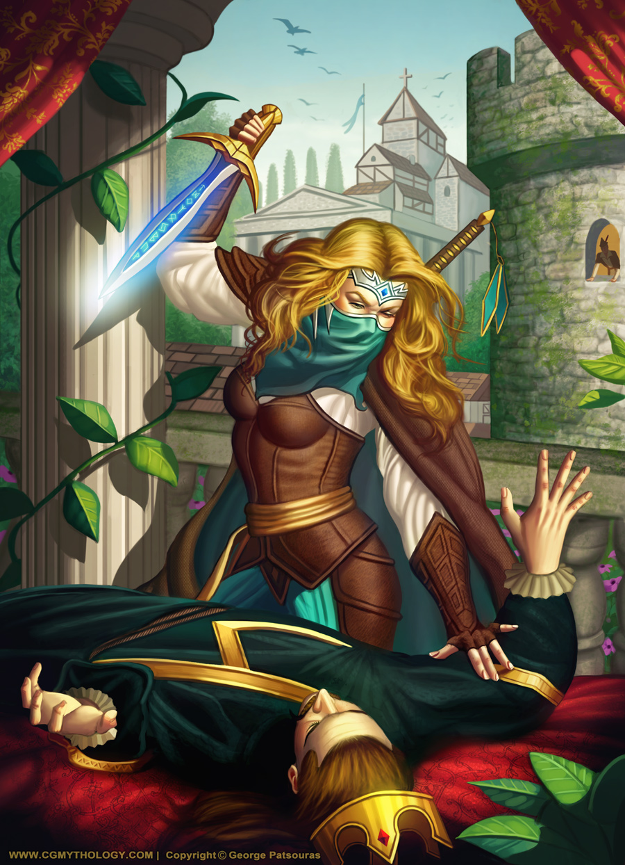
darktiste: Great input! I applied the atmospheric perspective on the background buildings to give it more depth. I did my best to fix those problem areas you pointed out as well, thanks again!
Delorias: Thank you! I tried to push the buildings further back value wise, and blurred them a bit so they don't pop so much. Hopefully it looks more natural now. Great point about the 100% white/black as well, revised the values in that regard and tones them down a bit. I revised the background figure as well, don't want to overwork him as I want the focus to be on the central figures, but hopefully it looks a bit better now! Also added some texture work to the clothing to give them more variety. Great input, thanks again!
dimensional-knight: Thank you, glad you dig the style! I love your suggestions in regards to saturation and contrast/values. In general I love using high contrast and strong colors for my images, but I guess I'm going about it too early in my process, so thanks for pointing it out, I will do my best to keep it in mind! The paintover you did is excellent and ridiculously useful, and a huge help in terms of values and colors especially, so I updated the image with that in mind. Really grateful you took the time to help me out with that, very much appreciate it!
............
The feedback I received was ridiculously useful! I took everything into consideration and heavily revised the image. Learned quite a bit about colors, values, and saturation with the critiques provided so I'm extremely grateful. I worked on the image a great deal and tried improve it as much as I could, and am pretty satisfied with the final image. Of course there's still some time for some minor tweaks and such if necessary, so please feel free to let me know any final input as always! Thanks again to everyone for the help, I'm ridiculously grateful for all the input I received!!!


