12-10-2021, 02:42 PM
(11-26-2021, 11:45 PM)darktiste Wrote: I prefer the other sketch to the one you developped for the pokesketch.I think it as to do with the bottom shape which resemble arrow for that reason i think it don't do wonder to lead the eye it actually do the oposition will the smaller one the proportion make the face read first and the smaller shape support it and one principle of gesture if i remember correctly is to have the major mass seem to fall off but have a solid anchor point to the ground to add dynamism so it why to me it look more dynamic and well proportioned.But i don't know why i say that if it not just to support your own opinion.
(If you like pokemon you might want to check my sketchbook i did a series of pokehead from 1 to around 151+)(The intention was to get better at lineart at that time)
http://crimsondaggers.com/forum/thread-3737-page-6.html
Loving your pokeheads series!! That's such a fun idea. reminds me of when i was in grade school and tried drawing every legendary pokemon....up to gen 4 i think? It was a blast and now i feel motivated to do something similar. Thanks, and i agree- i'd probably need to spend more time on linework getting the overall gesture and proportion to work before laying down paint and such (as is my usual problem hahaha)
-
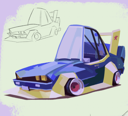
Dump!


worked on this a bit more....what's a rick without his morty??

Sketchbook: http://crimsondaggers.com/forum/thread-8823.html


