06-28-2023, 05:19 AM
Welcome back. I don't see why you should feel embarrassed, unless you feel like you haven't made as much time for drawing as you "should" have, maybe? Which is an understandable feeling, but no need to feel embarrassed; it's rarely something that can be helped.
Your latest drawing certainly looks more fluid and relaxed than the ones in your original post.
You did a good job of blocking out the lights and shadows, and the stylization is really nice. It's a very pleasing-looking drawing overall; I particularly like how you drew the shoulders and arms.
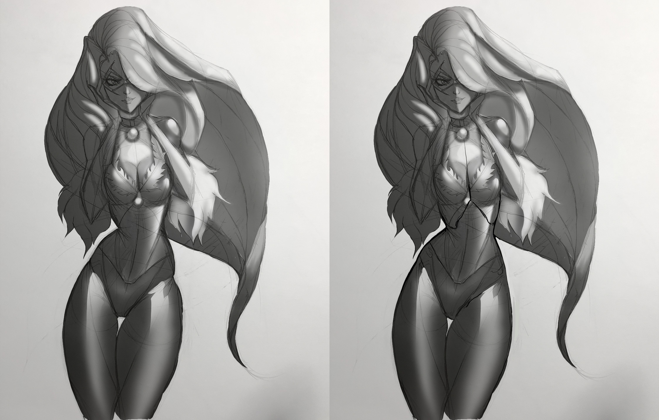
I think the contour of the hips and waist could be more realistic, so I did a paintover to try and explain. Also, feel free to take this with a grain of salt, since my paintovers tend to be more like "this is how I'd draw this" rather than "this is a better version of what you were trying to draw", but I tried to minimize arbitrary changes.
1. I thought the ribcage looked a little out of alignment below the breasts, so I added more fullness to the right side (our right) to try and make the tilt of it more clear.
2. I made the transitions from the ribcage to the waist and the flank to the hips little more gradual because I thought that might look nicer, but it's your call.
3. There's a strong tilt to the hips in this pose, but I thought the shading and contours needed to be adjusted to make that tilt more obvious. Minimal changes, but I thought it made a difference.
4. I made the contour of the right thigh (our right) more symmetrical with the left one because they're both in basically the same position.
Let me know if this was helpful or totally useless.


