11-12-2023, 01:42 AM
darktiste: Great choices! Ultimately I went with F but it ended up developing into something else entirely. Great point about the background, I do like the silhouette so I felt like leaving it empty might give it a bit of an abstract feel. I don't think every painting needs to have a highly detailed environment so it's good to experiment I think!
ballpoint: Great suggestions! I went with F as a starting point after giving it some thought!
...........
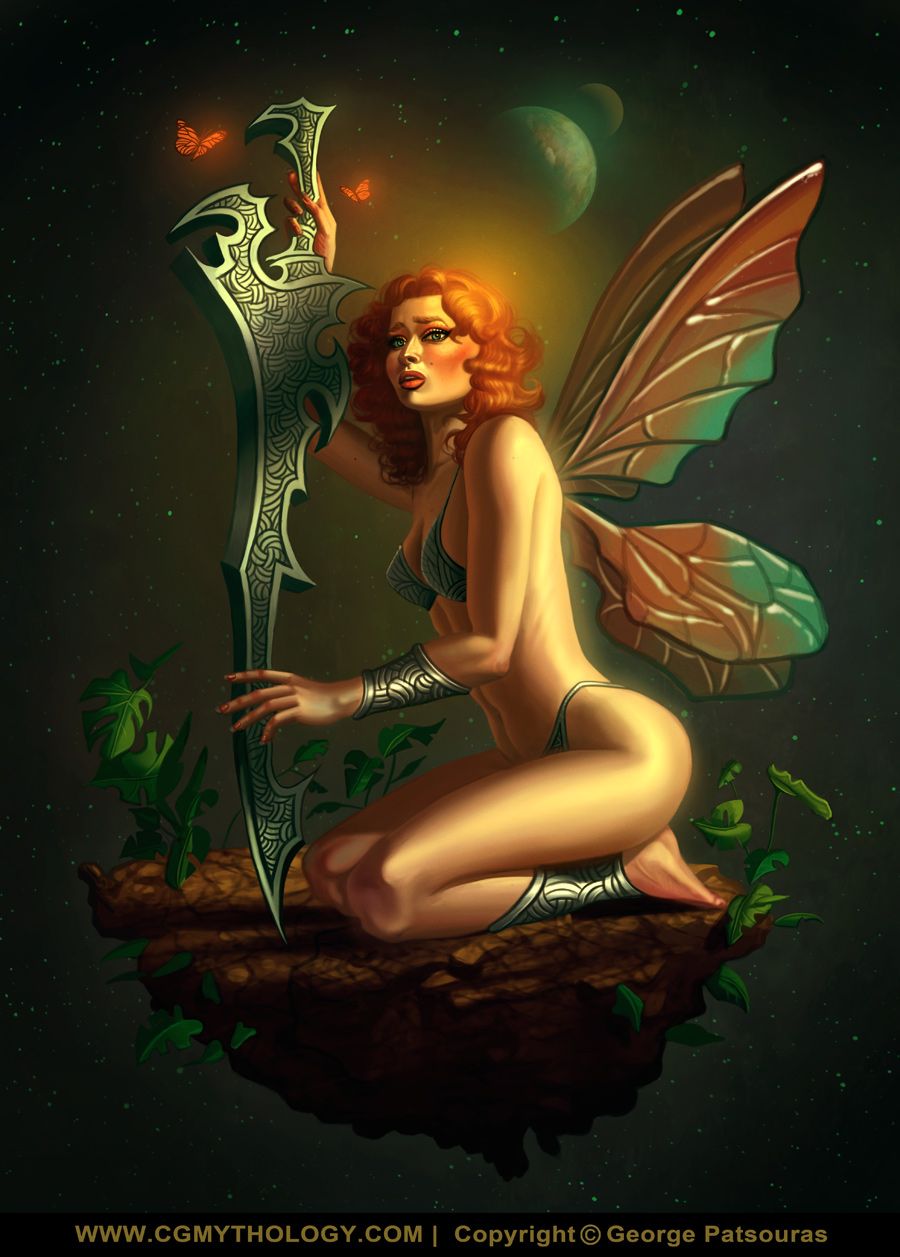
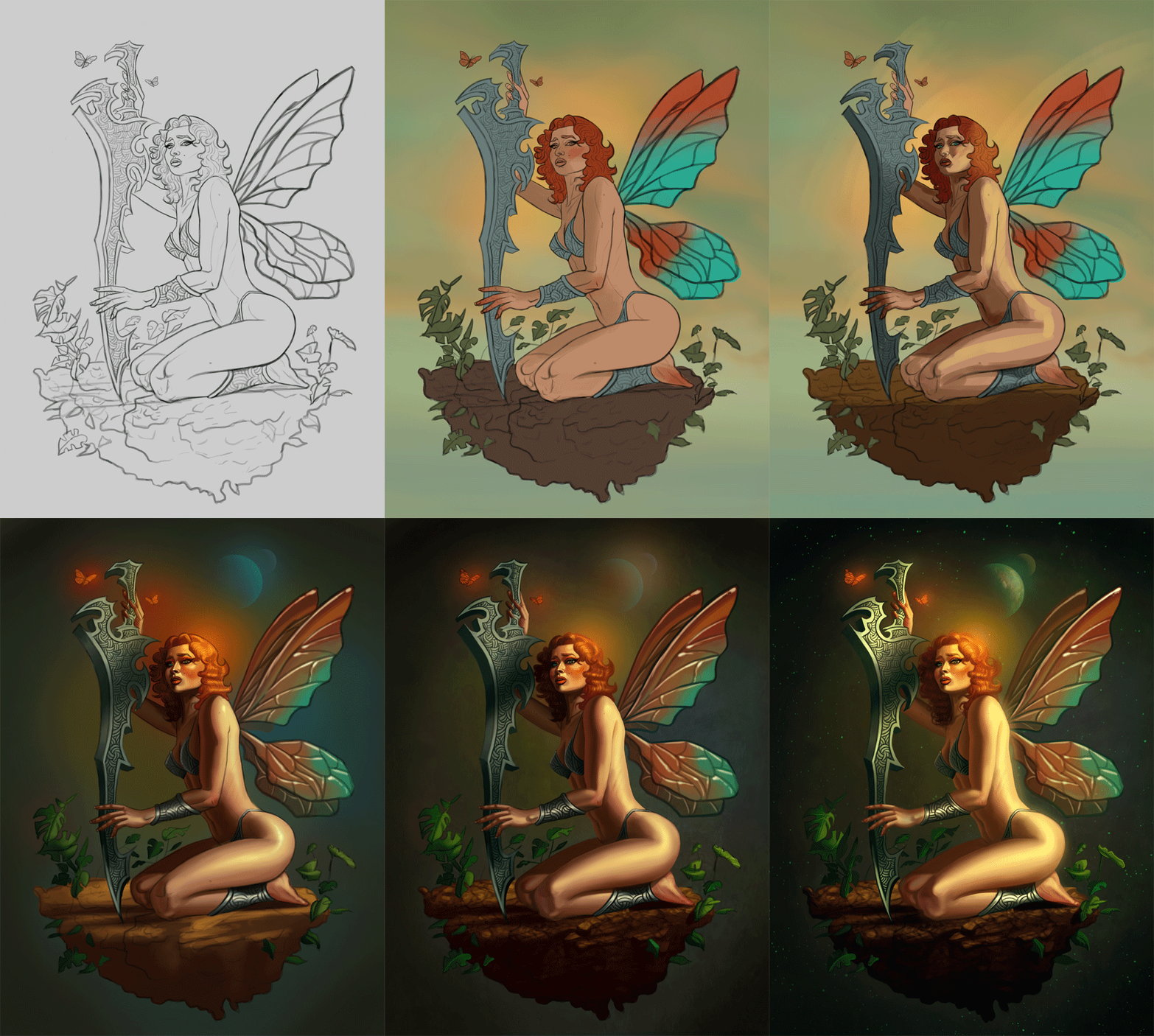
Thanks everyone for the suggestions! Ultimately I went with F as a starting point, but experimented with a darker environment early in the process which helped the figure pop, so I developed it that way. Ultimately I'm pretty happy with how it turned out. Below is the final followed by some steps. The image is pretty much finalized but I'll consider making changes if something major feels off, so please let me know!
.............
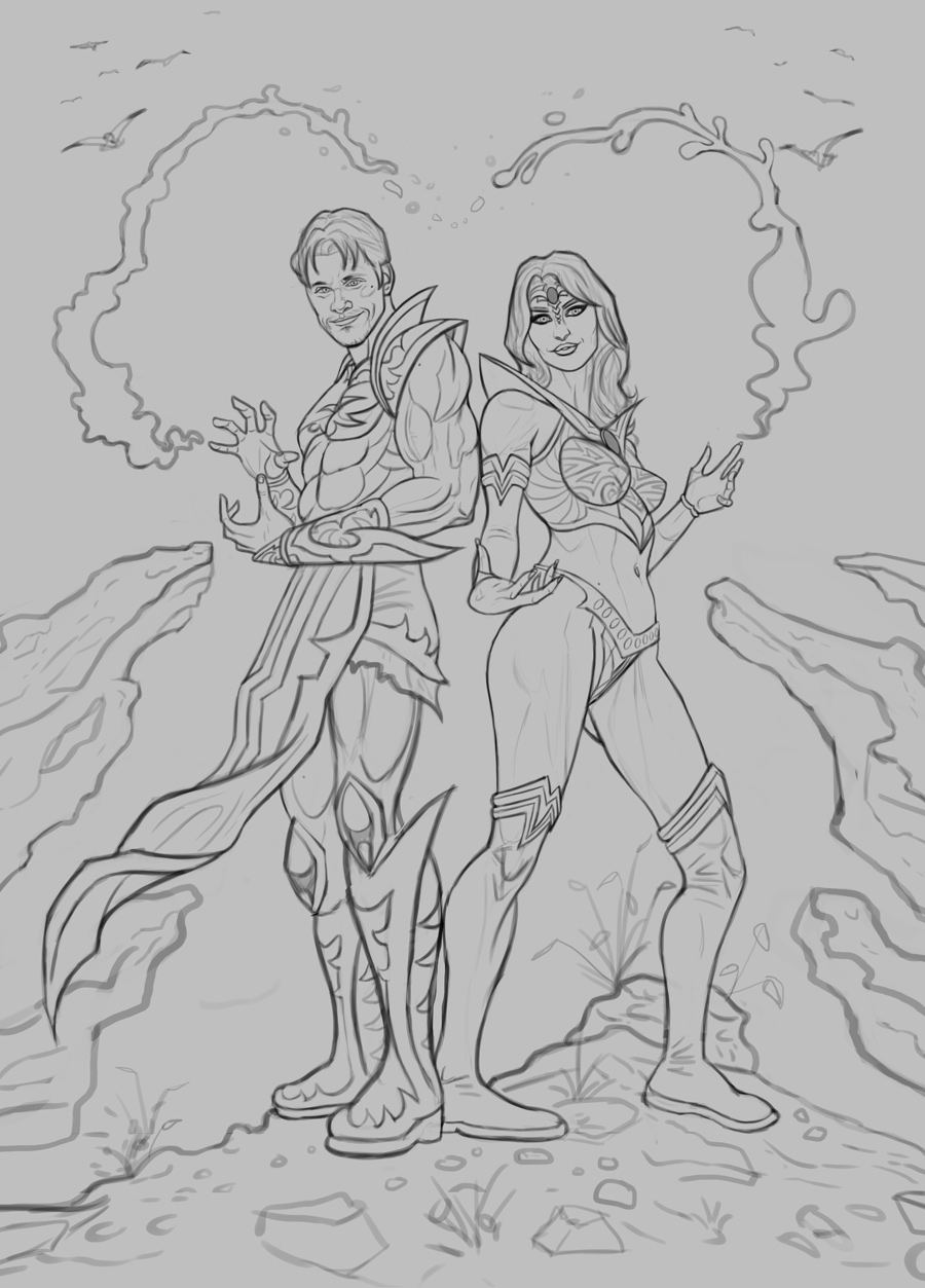
Next up is a new sketch. This will be a gift for two fellow artists I admired since I was a teenagerr - Henning Ludvigsen and Natascha Roosli; in fact they're work was my introduction to digital painting, and I learned quite a great deal from their work and tutorials so I thought I would paint them as fantasy characters as a gift for Christmas.
For the poses I had a reference from Satine Zillah that I bought from ArtStation that I did my best to recreate while coming up with my own original character designs. You can see in the sketch I've included some magical powers forming a 'heart' - I didn't want this to be too blatant, for an easter egg but I feel it work well compositionally.
I have some ideas for the colors, want something light, bright, and colorful but before I work on the color tests I would love to hear any input on the sketch as I'd like to get it as good as possible before complicating the image with colors, so any feedback would be great appreciated! Here is the sketch:

ballpoint: Great suggestions! I went with F as a starting point after giving it some thought!
...........
Thanks everyone for the suggestions! Ultimately I went with F as a starting point, but experimented with a darker environment early in the process which helped the figure pop, so I developed it that way. Ultimately I'm pretty happy with how it turned out. Below is the final followed by some steps. The image is pretty much finalized but I'll consider making changes if something major feels off, so please let me know!


.............
Next up is a new sketch. This will be a gift for two fellow artists I admired since I was a teenagerr - Henning Ludvigsen and Natascha Roosli; in fact they're work was my introduction to digital painting, and I learned quite a great deal from their work and tutorials so I thought I would paint them as fantasy characters as a gift for Christmas.
For the poses I had a reference from Satine Zillah that I bought from ArtStation that I did my best to recreate while coming up with my own original character designs. You can see in the sketch I've included some magical powers forming a 'heart' - I didn't want this to be too blatant, for an easter egg but I feel it work well compositionally.
I have some ideas for the colors, want something light, bright, and colorful but before I work on the color tests I would love to hear any input on the sketch as I'd like to get it as good as possible before complicating the image with colors, so any feedback would be great appreciated! Here is the sketch:
