12-17-2023, 04:32 PM
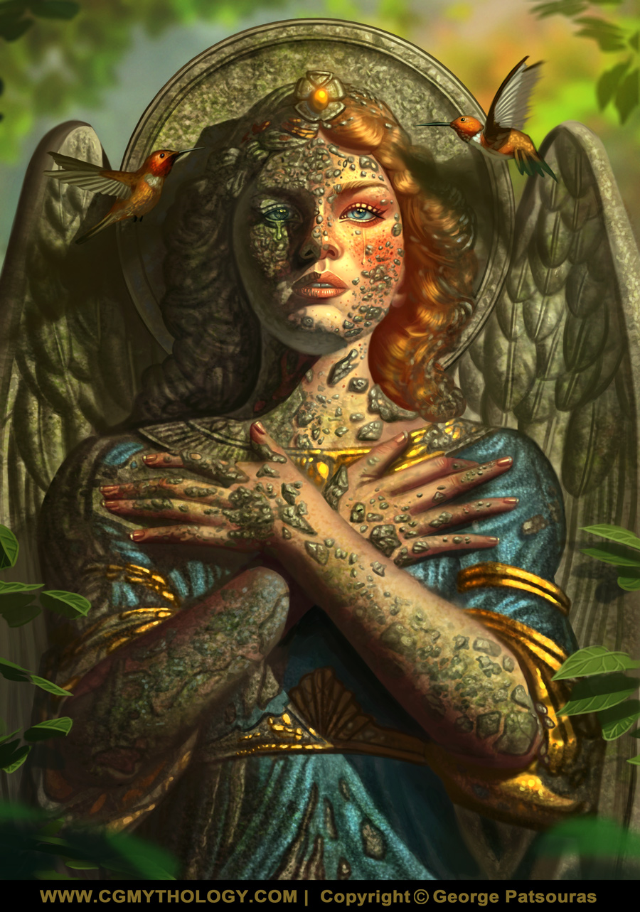
Lunatique: Thank you, and excellent point regarding the green lighting, I'll keep in mind for future reference. Also excellent suggestions regarding the specular lights, just incorporated it to the rocky surfaces and refined it a bit further.
I know what you mean regarding the more loose style, I also have the same inspirations as you as well, haha. I think you're doing great in regards to loosening up your style, you've made excellent progress since you've first started (I remember your fist portraits from Facebook where you first experimented with the new style). Thanks again for your input, always very constructive and helpful, and please keep up the great work!
................
Lots of updates today! First up is the recent image, I think I pretty much finalized it now. Basically did some final refinements to push the details and textures even further. I feel I overworked the image a bit so I'm calling it done for now, unless something major is off so please let me know! Here is the current progress:
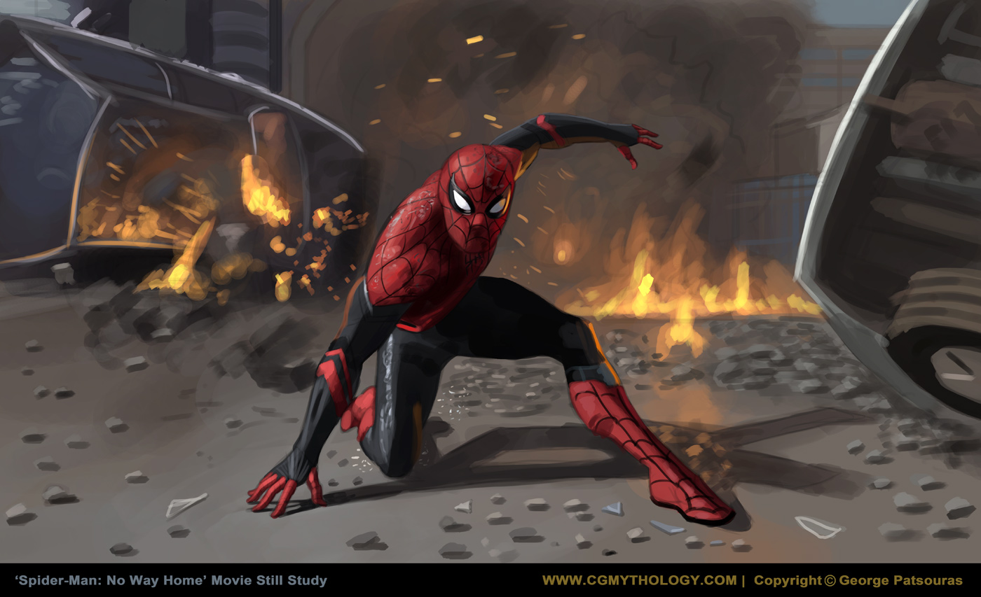
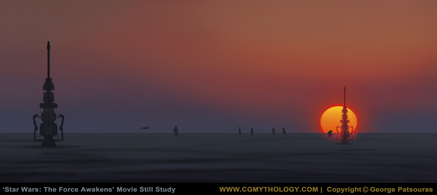
Next up are some movie still studies from various movies. What I looked for when researching the stills were dynamic lighting. So far I consider these studies successful as I have a better understanding of how lighting works, so I'll continue to do them. I'm not trying to refine these too much as well, want to keep the style loose and 'finish' once it looks decent enough and I've learned what I need to:

And finally I began work on a new illustration. The theme for this one is steampunk, and I wanted a landscape look for this one as I want to emphasize the environment a bit and I might also offer this as a wallpaper, we shall see. Below is the current sketch, any feedback on it would be most appreciated as I want to get it 100% right before begin work with colors:

I know what you mean regarding the more loose style, I also have the same inspirations as you as well, haha. I think you're doing great in regards to loosening up your style, you've made excellent progress since you've first started (I remember your fist portraits from Facebook where you first experimented with the new style). Thanks again for your input, always very constructive and helpful, and please keep up the great work!
................
Lots of updates today! First up is the recent image, I think I pretty much finalized it now. Basically did some final refinements to push the details and textures even further. I feel I overworked the image a bit so I'm calling it done for now, unless something major is off so please let me know! Here is the current progress:

Next up are some movie still studies from various movies. What I looked for when researching the stills were dynamic lighting. So far I consider these studies successful as I have a better understanding of how lighting works, so I'll continue to do them. I'm not trying to refine these too much as well, want to keep the style loose and 'finish' once it looks decent enough and I've learned what I need to:


And finally I began work on a new illustration. The theme for this one is steampunk, and I wanted a landscape look for this one as I want to emphasize the environment a bit and I might also offer this as a wallpaper, we shall see. Below is the current sketch, any feedback on it would be most appreciated as I want to get it 100% right before begin work with colors:


