05-09-2024, 01:46 AM
Lege1: Thank you! Much appreciated!
Neverland Ultra: Thanks, and great advice! I agree with what you said, I think a bit more texture would help in general. Sometimes I'm a bit obsessed about achieving a smooth and clean look so I'll try to be more conscious of this in the future!
Lunatique: Yes, I agree. I think what keeps me from doing that is that I feel sometimes that the image can look a bit 'unfinished' if there's too many strokes visible, like I didn't finish the blending process. But I tend to over-blend and overs-mooth, which can sometimes cause a bit of a lifeless look. I'll try to revise my technique further to include more texture and imperfection work. Thanks for your suggestions as always!
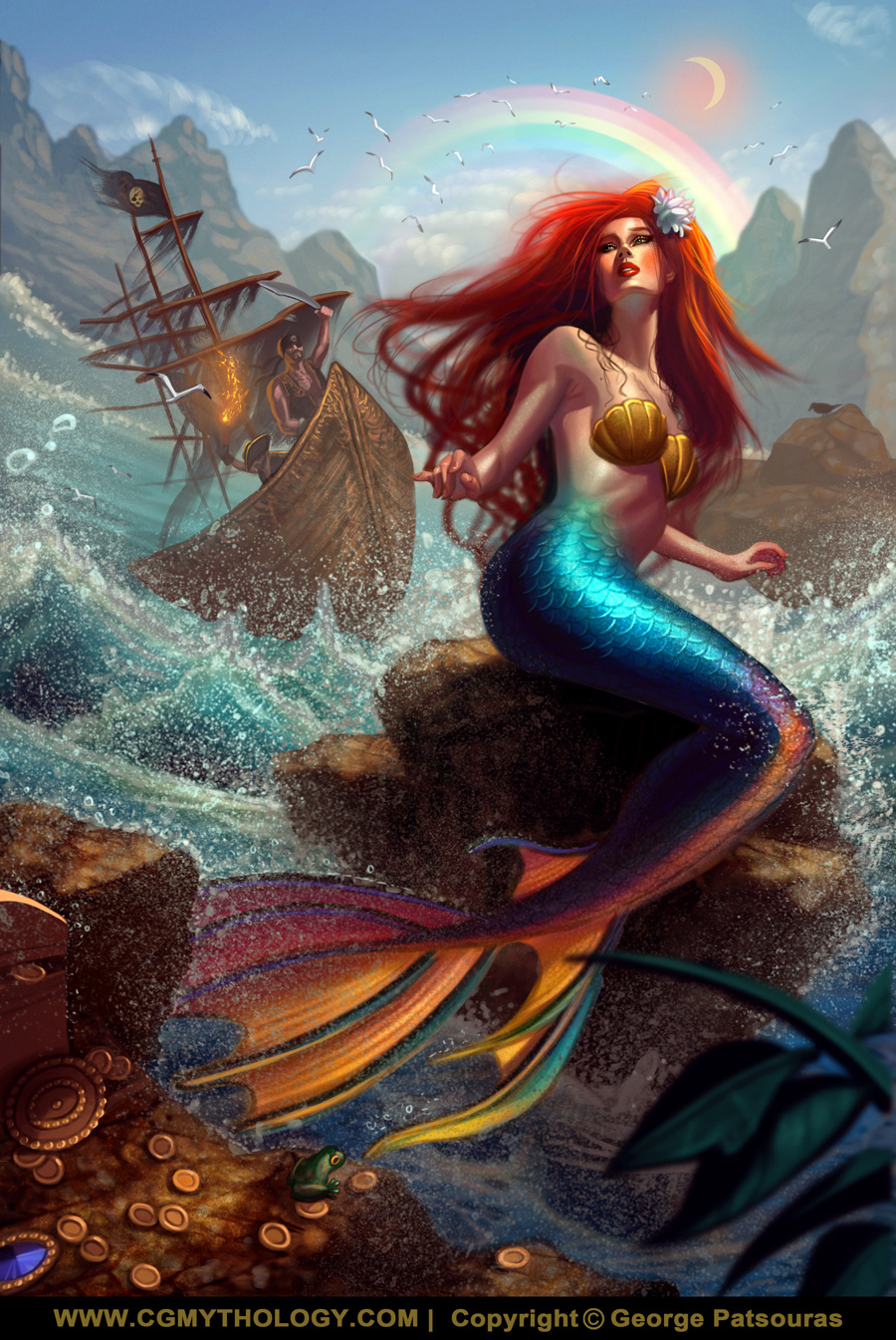
darktiste: Thanks and great input! I think the generic look for the pirates work in my favor for this particular image. The characters are all the way in the back and they're a bit hard to read as is, so using a cliche character design helps them pop out a bit and are more readable this way.
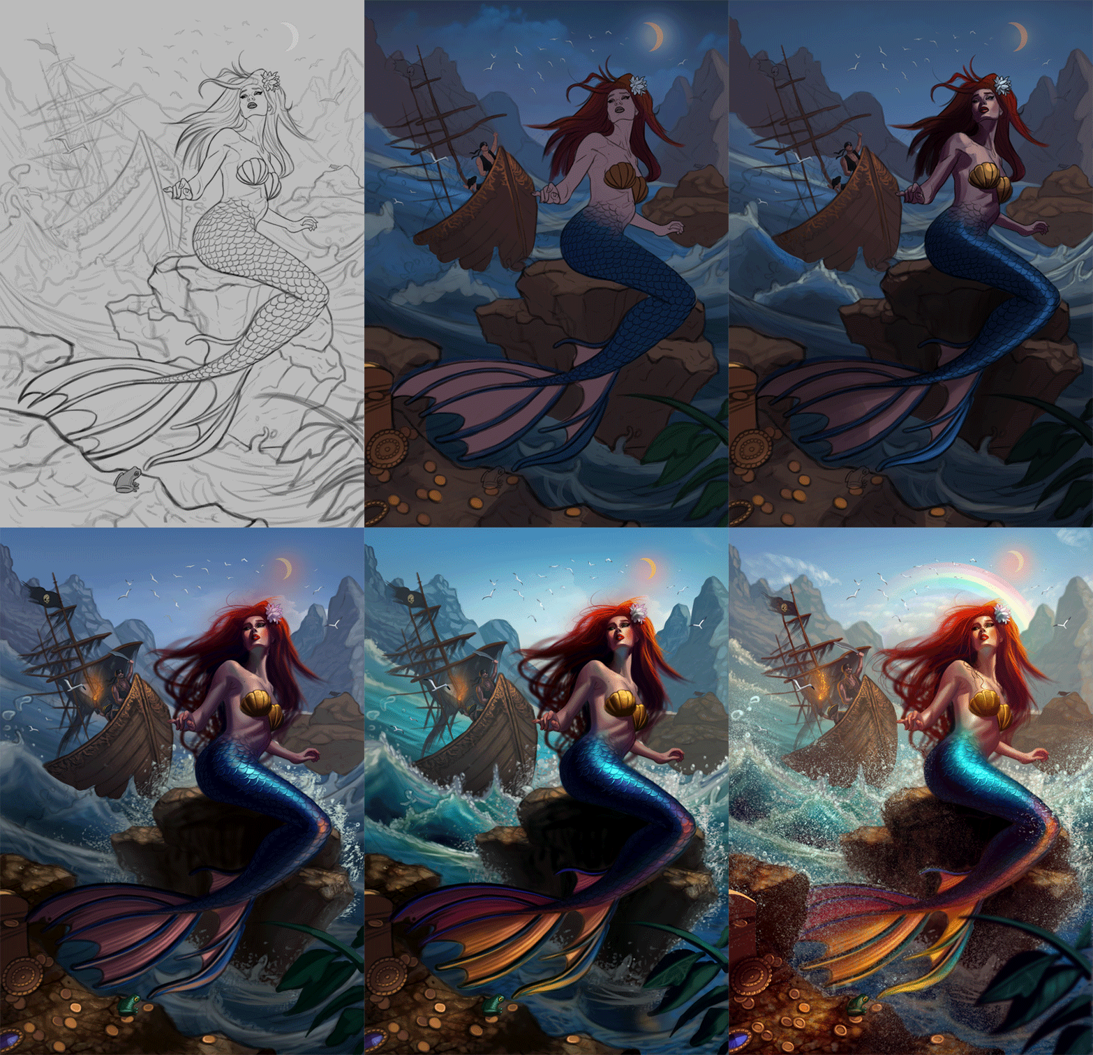
I was planning on adding rain and going for a darker feel in the early process but I chose to go bright and colorful to contrast the darkness of what is happening. This also helped me push the values further as well. Hopefully that was the right choice!
Great input regarding the scaling of the pirates/boat as well, just fixed that issue.
RottenPocket: Hmm not sure why you think that is, is something off about that area? Please let me know now that it's fully painted!
..................
I painted the image. Initially I was going for a darker feel but I decided to go with bright and colorful as well to make the image pop. Overall I'm quite pleased with how it turned out, and I'm open to any final input on the image so if something feels off please feel free to let me know! Below is the illustration followed by the steps for those interested.


