06-21-2024, 09:37 AM
Greetings
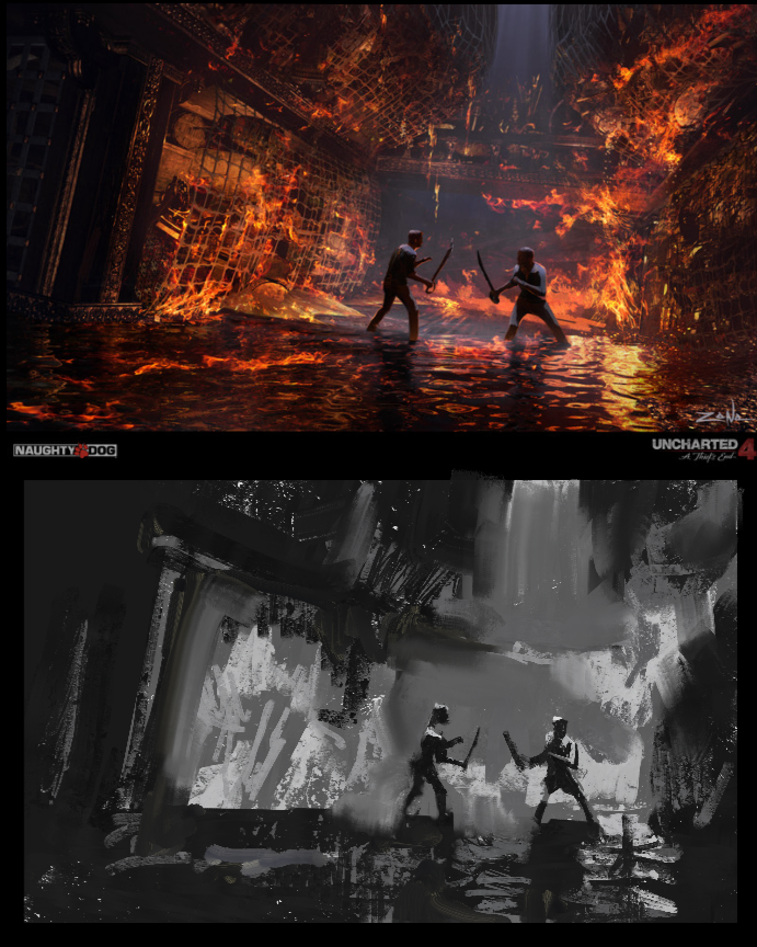
My take on the one on the right. Just wanted to see what I would do with a 10 min go at it. I feel you can't get an accurate read with these without focusing on the accurate placement of the shapes you are making. Simplifying is good, but less useful if they aren't accurate imo. The more accurate your simple shapes , the more you will understand how far the simple value read cab go in making the image read. Simple, shouldn't mean sloppy. I feel also using smaller shapes or textures can help when the scene dictates, like in this one, and probably helps you understand more about what approximate value family things belong in. I also like using a 1 or 2 value for the darkest and an 8 or 9 for the brightest. In fact you should probably match the value key in which the image is painted rather then picking arbitrary value buckets. Most images aren't as high contrast across the image, but this one was. You can also identify key hard and soft edges and put them in as well, not everything needs to be so hard edged and graphic imo.
This is basically only a 3 value study
.png)
My take on the one on the right. Just wanted to see what I would do with a 10 min go at it. I feel you can't get an accurate read with these without focusing on the accurate placement of the shapes you are making. Simplifying is good, but less useful if they aren't accurate imo. The more accurate your simple shapes , the more you will understand how far the simple value read cab go in making the image read. Simple, shouldn't mean sloppy. I feel also using smaller shapes or textures can help when the scene dictates, like in this one, and probably helps you understand more about what approximate value family things belong in. I also like using a 1 or 2 value for the darkest and an 8 or 9 for the brightest. In fact you should probably match the value key in which the image is painted rather then picking arbitrary value buckets. Most images aren't as high contrast across the image, but this one was. You can also identify key hard and soft edges and put them in as well, not everything needs to be so hard edged and graphic imo.
This is basically only a 3 value study
.png)


