06-30-2024, 08:50 AM
TrashPanda: I thank you very much on the congrats and good words as that always is a confidence booster. Thank you on the brief and I have to give credit to CBinnsIllustration really, I just modified something he was already onto; I'm glad you like it and look forward to seeing more progress. What you currently have is very cool, although it is a classic centaur; consider adding just another pair of legs in the middle to really stir things up. Also keep in mind that focus should be on the character, opposed to weapons, backgrounds, etc.
CBinnsIllustration: Off to a great start I see and this one is definitely evolving very organically. I was initially going to do an Octo-gal but went totally off-road exploring so many other possibilities. I did whip up a Octo-dude concept. Definitely a big fan of the black and gray approach as it is a great way to work fast and free, all my thumbnails were conducted like this with no prior sketching.
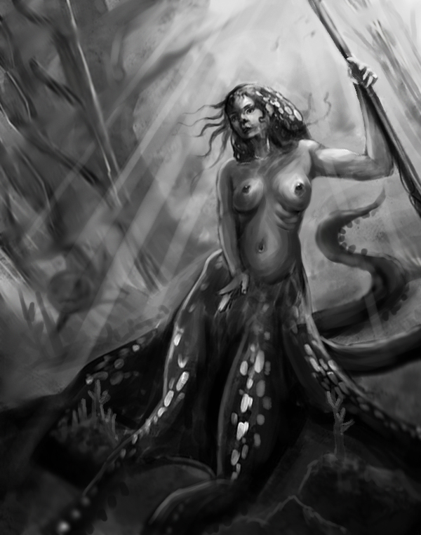
I got into your black and gray wip some, just showing a bit of different composition, but I got a little carried away free painting and listening to classical music lol, not gonna lie; don't take it the wrong way, it's just suggestive and I like it that much to get into it, so cheers no doubt.

Your color version is looking very cool, you are being very brazen and free in just exploring with the color and it shows in a good way. This composition is interesting cause the rule of thirds falls right on her breasts which really forcefully draws the viewer in, and you already know the importance of the face looking exceptionally good as that is a forced focal point regardless cause people are obcessed with identifying faces. Looking good though man and keep up the great work.
Darktiste: Thank you for your vote and I really went off the rails with that last entry. I just let loose and dared to do something completely absurd and different. I appreciate the good words and lucky for you they don't eat people.
I'd like to also lightly touch on what you wrote to CBinnsIllustration and everyone overall: You point out a lot of very good things, make good points, and suggestions, and the input, and participation from an observational standpoint is respected and appreciated. The validity of your input would indeed be much stronger if you would participate with us more from an art stand point cause it can sometimes feel you are just wanting to stand back and critique everyone's work without visually showing us anything. We would like to see all of this knowledge and philosophy you have put to work in the form of image making please this way we can see how everything works well while you go on to explain in words as well.
---------------------------------------------------------
So since the topic of thumbnailing has been brought into spotlight on the this forum, I decided to go off-road with producing a bunch. You guys please let me know what you might want to see me bring to completion please and I may even do a few more. Hopefully I can make the deadline, lol.
I've been keeping things really simple with these, just starting with black on like a 20% black background which helps control overusing white and just staying away from it overall in the thumbnailing stages; I feel strongly it should be looked at as bright light, and nothing more really. I've just been starting with 100% black and using either one brush, or like a combo of two mains and like one texture to get things done. The importance of focusing on the foundational elements like proper drawing, and values, is far superior than what brush to use, although brushes can curve the overall look some. Experimenting with different opacity and flow settings along with pressure settings go a long way too. These concepts are completely from imagination and I will most likely go linear on a re-draw of which one I'm going to do instead of working up the actual thumbnail, I'll most likely search for some reference and stuff too, to make everything that much more anatomically correct and convincing.
So I decided last minute I wanted to do some linear thumbs as well......


CBinnsIllustration: Off to a great start I see and this one is definitely evolving very organically. I was initially going to do an Octo-gal but went totally off-road exploring so many other possibilities. I did whip up a Octo-dude concept. Definitely a big fan of the black and gray approach as it is a great way to work fast and free, all my thumbnails were conducted like this with no prior sketching.
I got into your black and gray wip some, just showing a bit of different composition, but I got a little carried away free painting and listening to classical music lol, not gonna lie; don't take it the wrong way, it's just suggestive and I like it that much to get into it, so cheers no doubt.

Your color version is looking very cool, you are being very brazen and free in just exploring with the color and it shows in a good way. This composition is interesting cause the rule of thirds falls right on her breasts which really forcefully draws the viewer in, and you already know the importance of the face looking exceptionally good as that is a forced focal point regardless cause people are obcessed with identifying faces. Looking good though man and keep up the great work.
Darktiste: Thank you for your vote and I really went off the rails with that last entry. I just let loose and dared to do something completely absurd and different. I appreciate the good words and lucky for you they don't eat people.
I'd like to also lightly touch on what you wrote to CBinnsIllustration and everyone overall: You point out a lot of very good things, make good points, and suggestions, and the input, and participation from an observational standpoint is respected and appreciated. The validity of your input would indeed be much stronger if you would participate with us more from an art stand point cause it can sometimes feel you are just wanting to stand back and critique everyone's work without visually showing us anything. We would like to see all of this knowledge and philosophy you have put to work in the form of image making please this way we can see how everything works well while you go on to explain in words as well.
---------------------------------------------------------
So since the topic of thumbnailing has been brought into spotlight on the this forum, I decided to go off-road with producing a bunch. You guys please let me know what you might want to see me bring to completion please and I may even do a few more. Hopefully I can make the deadline, lol.
I've been keeping things really simple with these, just starting with black on like a 20% black background which helps control overusing white and just staying away from it overall in the thumbnailing stages; I feel strongly it should be looked at as bright light, and nothing more really. I've just been starting with 100% black and using either one brush, or like a combo of two mains and like one texture to get things done. The importance of focusing on the foundational elements like proper drawing, and values, is far superior than what brush to use, although brushes can curve the overall look some. Experimenting with different opacity and flow settings along with pressure settings go a long way too. These concepts are completely from imagination and I will most likely go linear on a re-draw of which one I'm going to do instead of working up the actual thumbnail, I'll most likely search for some reference and stuff too, to make everything that much more anatomically correct and convincing.
So I decided last minute I wanted to do some linear thumbs as well......


LEGEND'S SKETCHBOOK_001
To all artists struggling to create and are intimidated by A.I. (anti-imagination)
 "Everything has been done, but not by you"
To all artists struggling to create and are intimidated by A.I. (anti-imagination)
 "Everything has been done, but not by you"


