08-04-2024, 01:34 PM
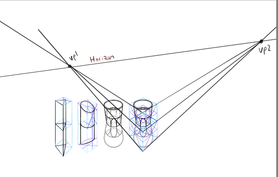
Okay awesome! Those all look better. The construction techniques are A+. The glass still looks a bit funky though actually, and it's not due to the mirroring technique, but rather the placement of the vanishing points I think. You can see that the bottom ellipse is really wide, almost circular, which feels strange. The square you've drawn it in does diminish back in space, so it is done correctly it just seems strange. If we extend out your lines you can see that the horizon would have to be tilted, and the VPs quite close to each other, too, causing this effect.

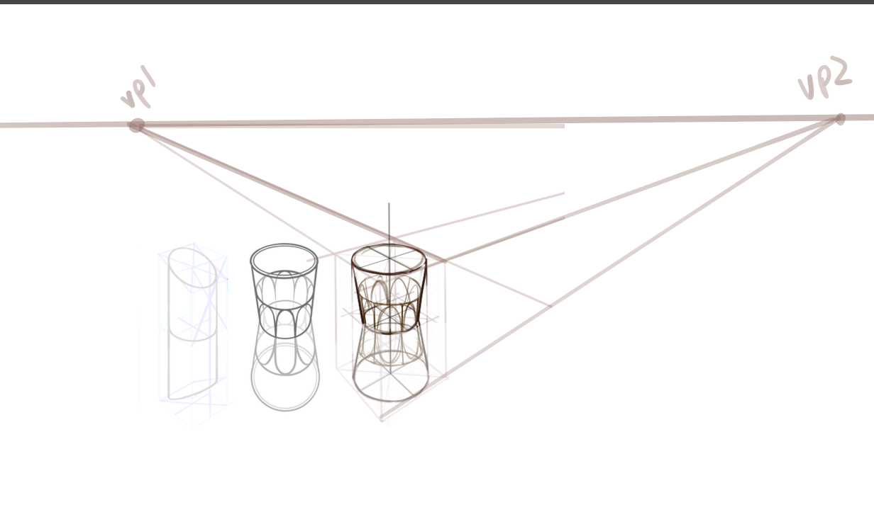
If I just lower the second VP to the height of the first one, just make the points a little further apart. and resketch the object, this is the result. I think it looks a bit more natural. Ironically it looks almost like what you had in the first place. I think it's something to be aware of, though. Even if you are freehanding the perspective, you wanna make sure it feels right. We actually usually don't want the angle of the lines to have too much depth, as it starts to break the illusion as they approach 90 degrees. And it is just an illusion after all.

The other objects look good, it's clear you have a handle on the technique.
I didn't know a triangle would fit into a square that way either, I tried it with the point going to the opposite edge of the square and it looks really weird and long, and that's how I realized.
Your idea for the skeleton cave sounds really cool! Will be interested to see what you do with it, one way or another. Even if you do it now and it looks bad, you can always redo it in the future. But of course it depends on what you feel is a good use of your time at present.

If I just lower the second VP to the height of the first one, just make the points a little further apart. and resketch the object, this is the result. I think it looks a bit more natural. Ironically it looks almost like what you had in the first place. I think it's something to be aware of, though. Even if you are freehanding the perspective, you wanna make sure it feels right. We actually usually don't want the angle of the lines to have too much depth, as it starts to break the illusion as they approach 90 degrees. And it is just an illusion after all.

The other objects look good, it's clear you have a handle on the technique.
I didn't know a triangle would fit into a square that way either, I tried it with the point going to the opposite edge of the square and it looks really weird and long, and that's how I realized.
Your idea for the skeleton cave sounds really cool! Will be interested to see what you do with it, one way or another. Even if you do it now and it looks bad, you can always redo it in the future. But of course it depends on what you feel is a good use of your time at present.


