08-24-2024, 08:40 PM
darktiste: Thanks for your input! I was happy with the initial sketch so I didn't see the need to do additional sketches. I really like what you did with the angle of the image, I feel it makes for a stronger composition and grounds the figure more so I altered it to our suggestion, thank you for that. Also did some tweaks to the image to better incorporate your feedback.
one_two: Great input, in general I start with hard edged brushes but I switch to softer ones for a more smoother look. Sometimes it can flatten it a bit but I try to add textures on top to avoid that look and make it a bit more interesting.
..............
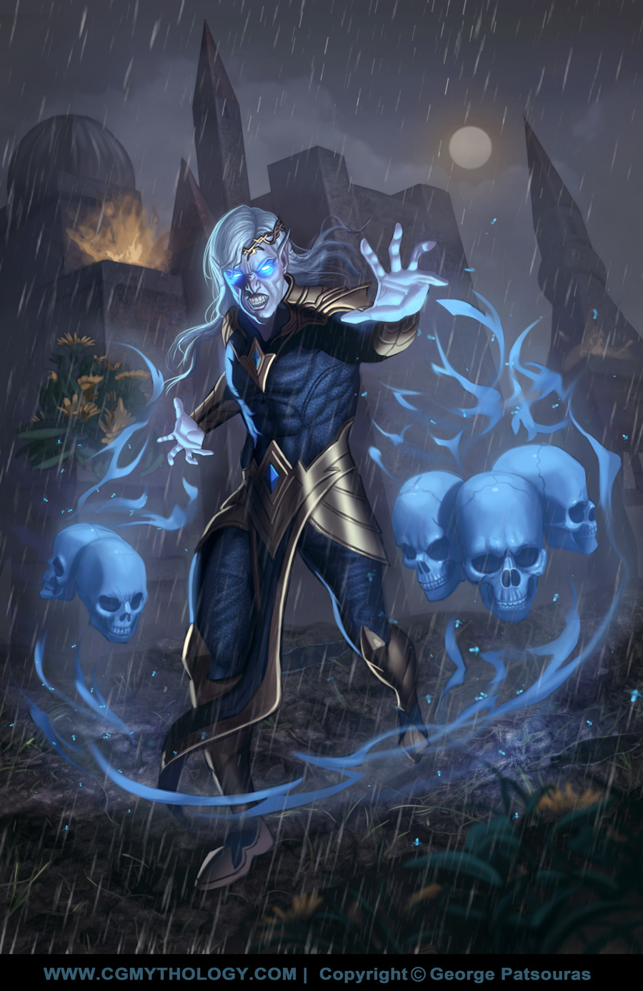
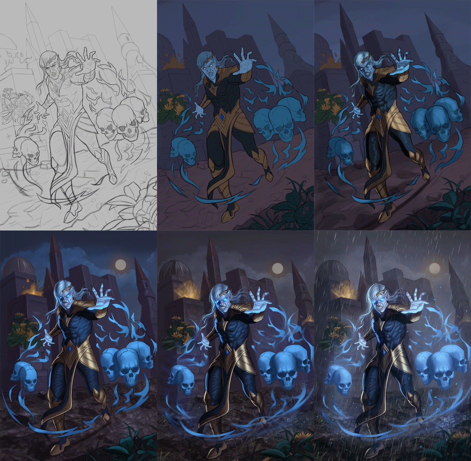
I worked on the image and it's pretty much finalized although I'm open to hearing any feedback on it. Below is the final followed by the steps for those interested!


