01-27-2025, 01:16 PM
Wow love how the dragon one turned out! Beautiful, firey sunset light on it.
On the boar one, I like the concept of the painting, and overall the vibe is cool. I think you could spend more time on the big picture stage with the values and colors before detailing, though. On this one I see a lot of smaller details, like the gun and the wallpaper pattern, which while interesting, kind of draw my attention, meanwhile the lighting feels a bit unfocused. With the color, there's a bit of murkiness to it around the walls.
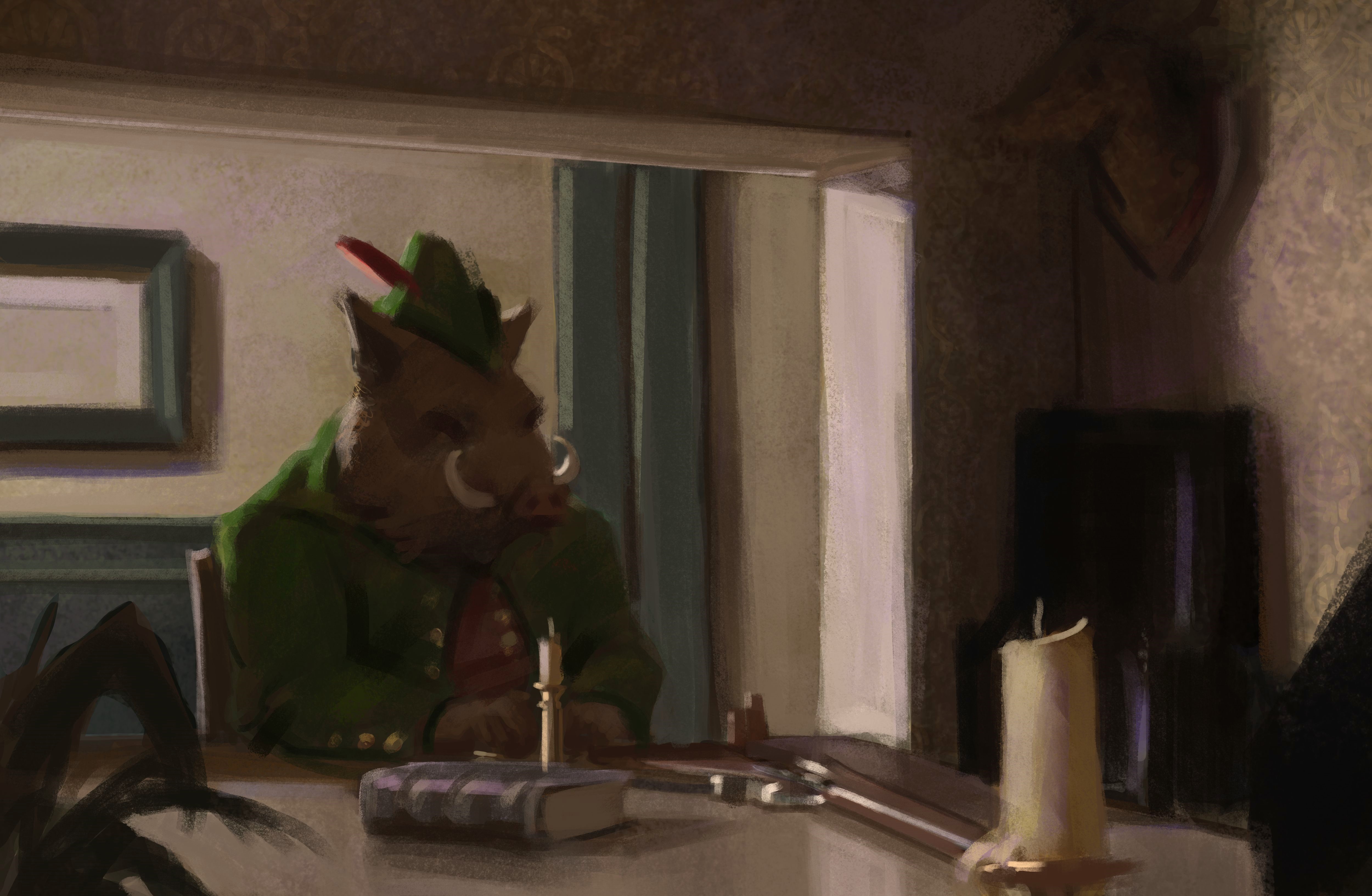
Just since you said you want to improve color, I did a bit of a sketch over, kind of going back to the big flat shapes stage to see if the color relationships can be more powerful. I liked in yours how there were touches of blue mingled with the yellow of the wall around shadows and edges. So it's starting to look interesting, but the 'rules' of where blue should be and exactly what color and value everything needs to be to read, are maybe a little shaky. So idk, I'm sure it's not exactly what you're going for but my suggestion is just to play around with each piece of the image, and figure out what reads, and if you start to get something that works, keep going to see if there's any adjustments to an area that work even better.
Once you have well established what color each different thing is in light, and what color it is in shadow, you can paint really powerfully. Like here, I think I have established pretty well what the color white looks like in this context by playing around with it and getting it consistent across the image. So if I wanted to add another white object, or start detailing his tusks, for example, it would be pretty much guaranteed to work out.
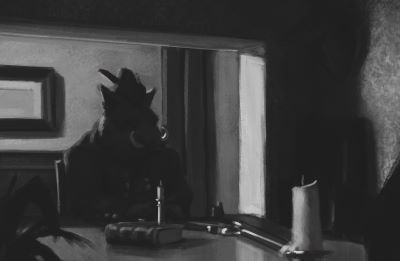
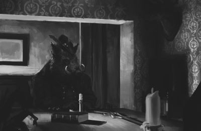
And then another suggestion is try a filter or something to reduce the values to masses. Mess with levels in photoshop, whatever works for you. But like side by side paintover with filter, we get a pretty good 3 value comp, though could maybe be better if the dark shapes on the wall in back were lightened.
Original: wallpaper pattern sticks out a lot, mass of the boar feels like it's fighting the gradient on the wall behind a bit. And yeah it's just a filter, so it can be flattering or unflattering, but I do it a lot just to look at it a different way and get an idea of what could be stronger.
Keep it up though, I'm honestly loving all your sketches!
On the boar one, I like the concept of the painting, and overall the vibe is cool. I think you could spend more time on the big picture stage with the values and colors before detailing, though. On this one I see a lot of smaller details, like the gun and the wallpaper pattern, which while interesting, kind of draw my attention, meanwhile the lighting feels a bit unfocused. With the color, there's a bit of murkiness to it around the walls.
Just since you said you want to improve color, I did a bit of a sketch over, kind of going back to the big flat shapes stage to see if the color relationships can be more powerful. I liked in yours how there were touches of blue mingled with the yellow of the wall around shadows and edges. So it's starting to look interesting, but the 'rules' of where blue should be and exactly what color and value everything needs to be to read, are maybe a little shaky. So idk, I'm sure it's not exactly what you're going for but my suggestion is just to play around with each piece of the image, and figure out what reads, and if you start to get something that works, keep going to see if there's any adjustments to an area that work even better.
Once you have well established what color each different thing is in light, and what color it is in shadow, you can paint really powerfully. Like here, I think I have established pretty well what the color white looks like in this context by playing around with it and getting it consistent across the image. So if I wanted to add another white object, or start detailing his tusks, for example, it would be pretty much guaranteed to work out.

And then another suggestion is try a filter or something to reduce the values to masses. Mess with levels in photoshop, whatever works for you. But like side by side paintover with filter, we get a pretty good 3 value comp, though could maybe be better if the dark shapes on the wall in back were lightened.
Original: wallpaper pattern sticks out a lot, mass of the boar feels like it's fighting the gradient on the wall behind a bit. And yeah it's just a filter, so it can be flattering or unflattering, but I do it a lot just to look at it a different way and get an idea of what could be stronger.


Keep it up though, I'm honestly loving all your sketches!


