11-16-2012, 10:58 PM
(11-15-2012, 04:57 PM)atrenr Wrote: Really really cool stuff already man!
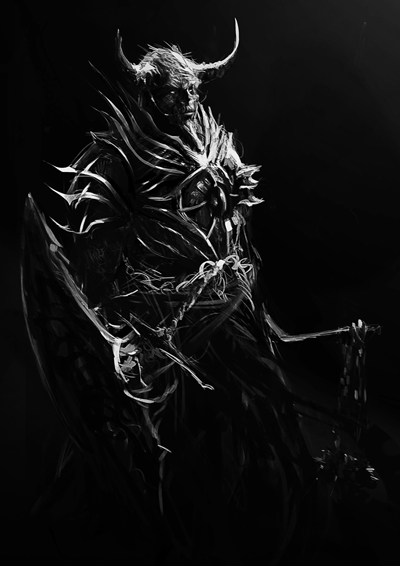
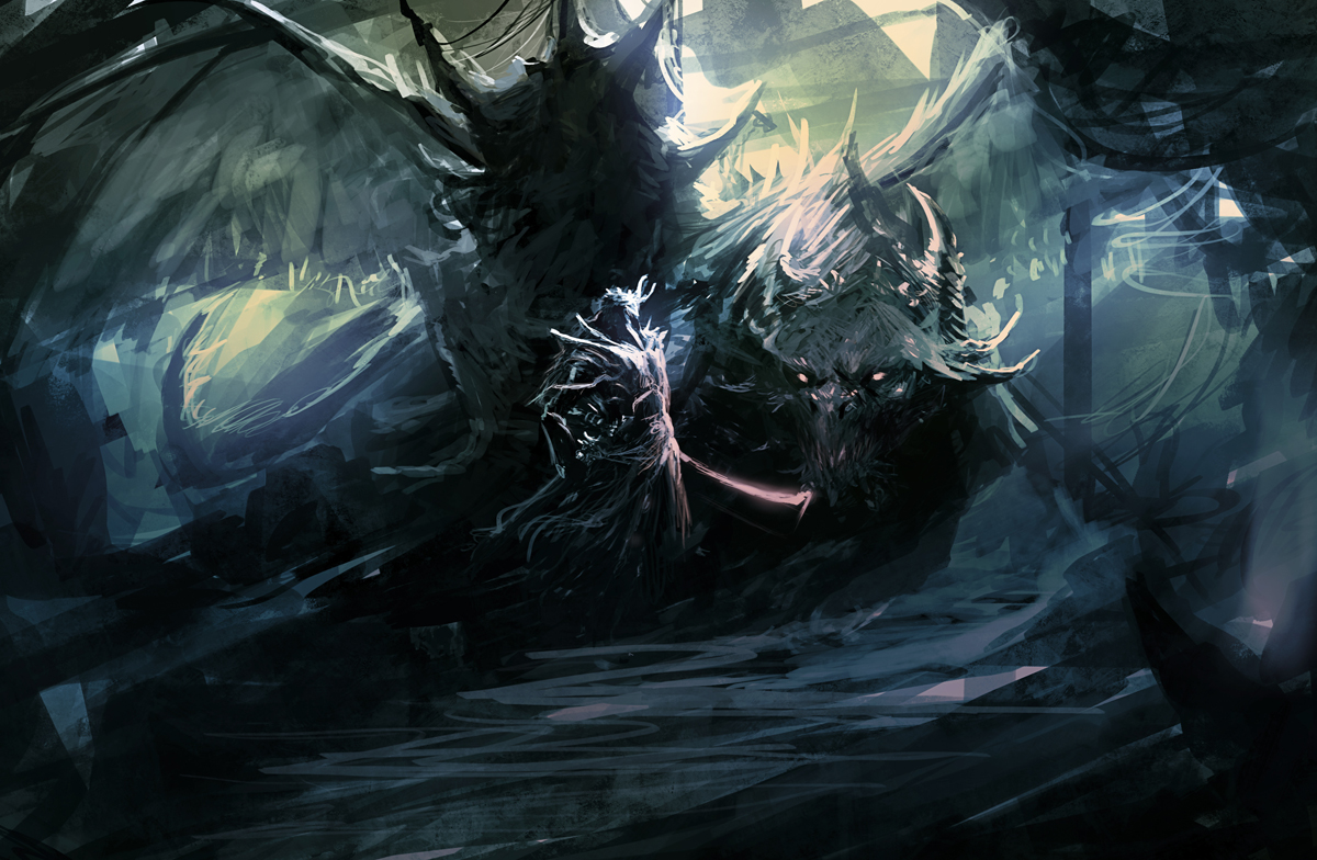
As for feedback, you're getting a little too dark value-wise in your stuff, you should try not to go to pure black as it eats away at color in the piece overall, distracting the eye from the cool parts of the piece. Comparing the flame sword guy to the green ghost in this regard, the ghost is better as you can look at the image without getting distracted by lots of pure blacks, while with flame sword my eye is getting drawn to the face mask and not his face as a whole.
Can't wait to see more, I really like your concepts and designs so far.
Thank you, dude!
U r right! I use too much dark tones and pure black and white in my images! >: It's kind a vicious that i have. I'm trying to change that with my recent studies. Now i can see an great evolution in the quality of my work!
A lot of sketchs are coming!
Continuing with the hard work!
:D
For sure, my way of study is very unusual. But, i think it works for me! :b


