02-13-2012, 02:28 PM
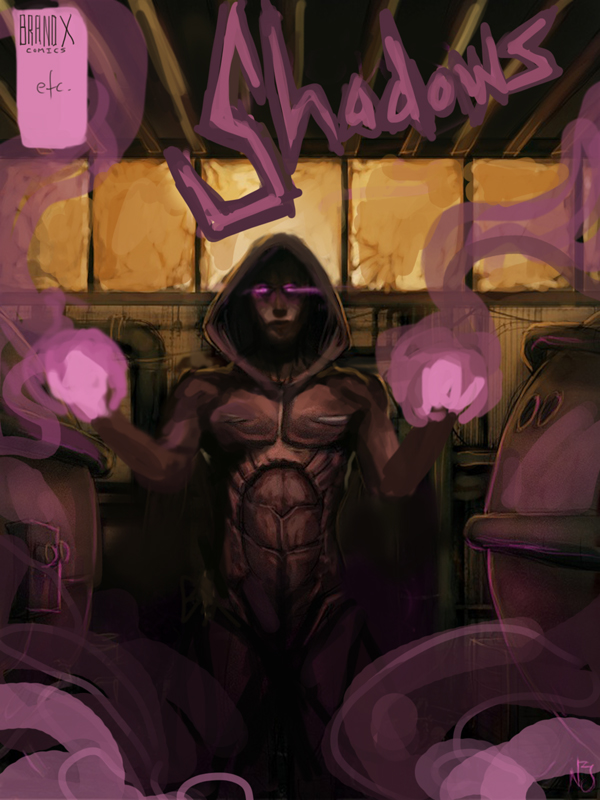
Nicky, hey what up? I really dig what you've got going on so far. I think one suggestion that I would make is to avoid sacrificing form for detail. In that last piece things go awry when you really start crunching down on the forms, going for rim lighting and core shadows etc. If you take a step back, you'll notice that you've got some structural mistakes that need correcting before you start bustin ass on the rendering. The head is definitely to small, and the arms are a bit janky on the anatomy. You need to get in the habit of flipping your canvas too (if you aren't already), there are some symmetry issues that need resolving, especially considering it's a frontal pose. Also, think about your lighting situation, things don't seem to mesh up.
Compositionally, you need to think about the whole page, you have a lot of inactive area that needs to be utilized. Stay away from pre-made typography too. In a comic, you need to hand design a custom title for branding reasons.
I hope you don't mind, but I did a quick draw over to express what I am saying a bid more clearly.
I wish you the best. Keep pushing on!


