05-09-2013, 08:01 PM
When in doubt go back to basics.
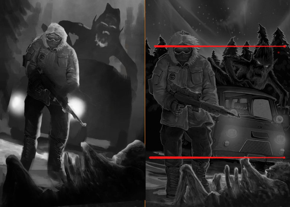
Analyse your broad value arrangement. You'll see everything is in large horizontal blocks which is why the comp is so uninteresting. You also haven't created depth in your value structure.
I redid a quick comp using value to create the depth. Also jiggled the comp to have 3 focal points with movement between them..and kept the highest contrast for the main points of focus.


