05-31-2013, 08:26 PM
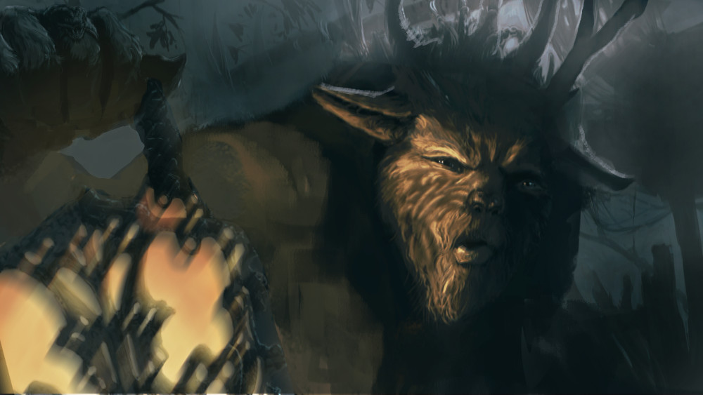
Agree with previous comments. I'd add that the lantern takes up exactly the same amount of space as the face and creates this kind of boring horizontal block in the comp, and the face is smack in the middle of the canvas too. I did a quick paintover to move some things around. Hope its useful. Nice work so far btw...I love the feel of the image.


