Thumbnail Crit
#5
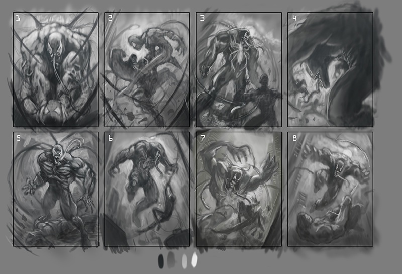
I did more thumbnails and choose the 8 that I like best. It is a cover design focusing on Venom, Spider-Man needs to be in the comp but does not hold the main focus of the piece. The first round Of thumbnails i stuck to the idea of the camera behind Spider-Man emphasizing the size difference between the two characters. In this next set of thumbnails I explored other ideas. I would love all thoughts.


Thanks so much for your time.

Reply


Messages In This Thread
Thumbnail Crit - by Elmst - 06-06-2013, 11:08 AM
RE: Thumbnail Crit - by arden - 06-06-2013, 12:26 PM
RE: Thumbnail Crit - by Amit Dutta - 06-06-2013, 08:33 PM
RE: Thumbnail Crit - by Elmst - 06-07-2013, 12:17 AM
RE: Thumbnail Crit - by Elmst - 06-10-2013, 01:16 AM
RE: Thumbnail Crit - by Amit Dutta - 06-10-2013, 06:37 PM
RE: Thumbnail Crit - by arden - 06-12-2013, 12:30 AM
RE: Thumbnail Crit - by Elmst - 06-12-2013, 12:24 PM
RE: Thumbnail Crit - by Elmst - 07-05-2013, 11:39 AM
RE: Thumbnail Crit - by Elmst - 07-06-2013, 01:42 PM
RE: Thumbnail Crit - by Madzia - 07-07-2013, 03:57 AM
RE: Thumbnail Crit - by Elmst - 07-08-2013, 01:23 PM
RE: Thumbnail Crit - by Tetsuo - 07-09-2013, 04:34 AM
RE: Thumbnail Crit - by Elmst - 07-18-2013, 01:46 PM

Forum Jump:


Users browsing this thread: 6 Guest(s)