06-19-2013, 10:39 AM
Awesome idea! Big robots and computer dudes! I got a bunch of stuff you can consider. Brace yourself!
First thing to do is fix the composition. If you want to push the height of something narrow the canvas. I also flipped the computer dude to the other side, it felt right, compositionaly and because he's facing the robot straight on, you know computer dude is getting it done.

Ok things are about to get crazy. So here I started adding atmosphere to push the robot back. To further emphasize the distance I toned down the detail on the mech using the pallet knife filter. I also have begun desaturating the image, because those bright colors were too bright. I also lightly tweaked the lighting a bit using a color dodge layer and painting on the desired color I wanted brightened. Other things, I added a little control desk and that beam going across the top for composition, it helps keep the viewers eye inside the image.

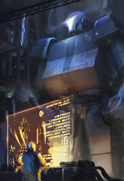
Now I'm adding more atmosphere and deciding which parts should be more saturated. In the end the most saturated parts are the coputer dude and the head of the robot. I also shifted over the computer guy to keep him in scene and added a more interesting shape to the desk. I then brought in the color dodge layer again to bring out some spots I wanted brightened. Then I darkened the computer guy and his desk.

So in conclusion the most important things to remember are to be careful not to over saturate the image, also things that are are farther away should get less detail and not be as dark as things in the foreground. The composition still isn't quite right, you could probably watch transformers or pacific rim to get some better compositions for where to place a giant robot in perspective with a normal sized person.
Oh yes and I almost forgot, your image resolution was set at 28.346, in general I only use 3 resolution sizes depending on what the image is for. 72 dpi is the internet standard resolution, I use that anytime I post to the net. I also use 150 or 300 dpi for things I plan on printing. Resolution size isn't that big of a deal but there is a norm that people use.
Hope this helps! Keep at it!
First thing to do is fix the composition. If you want to push the height of something narrow the canvas. I also flipped the computer dude to the other side, it felt right, compositionaly and because he's facing the robot straight on, you know computer dude is getting it done.

Ok things are about to get crazy. So here I started adding atmosphere to push the robot back. To further emphasize the distance I toned down the detail on the mech using the pallet knife filter. I also have begun desaturating the image, because those bright colors were too bright. I also lightly tweaked the lighting a bit using a color dodge layer and painting on the desired color I wanted brightened. Other things, I added a little control desk and that beam going across the top for composition, it helps keep the viewers eye inside the image.

Now I'm adding more atmosphere and deciding which parts should be more saturated. In the end the most saturated parts are the coputer dude and the head of the robot. I also shifted over the computer guy to keep him in scene and added a more interesting shape to the desk. I then brought in the color dodge layer again to bring out some spots I wanted brightened. Then I darkened the computer guy and his desk.

So in conclusion the most important things to remember are to be careful not to over saturate the image, also things that are are farther away should get less detail and not be as dark as things in the foreground. The composition still isn't quite right, you could probably watch transformers or pacific rim to get some better compositions for where to place a giant robot in perspective with a normal sized person.
Oh yes and I almost forgot, your image resolution was set at 28.346, in general I only use 3 resolution sizes depending on what the image is for. 72 dpi is the internet standard resolution, I use that anytime I post to the net. I also use 150 or 300 dpi for things I plan on printing. Resolution size isn't that big of a deal but there is a norm that people use.
Hope this helps! Keep at it!


