07-06-2013, 06:37 AM

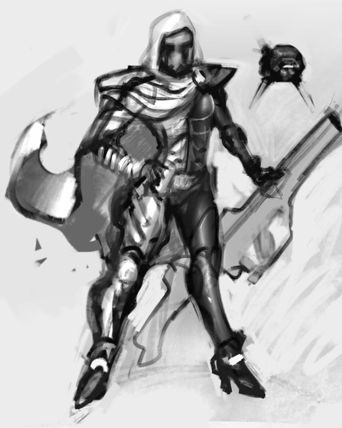
Hey there, please take anything i write as constructive criticism. This is a training room. So far, you have a figure and not so much a character so really you are forming this idea as you work. She has a VERY strong starwars vibe that I think will fade away the more you add to her. I like the asymmetrical armor and I think you should consider her silhouette (without the cape) when designing her armor. Make one side have all sorts of internal and embedded chunky armor while the other side is sleek and form fitting. Try and give the cape something interesting to do too. have it getting kicked up by a gust of wind. Her pose is pretty standard for character design but you could accentuate it even further by making her either more masculine or more feminine. Have you ever seen the anime, Gurren Laagan? The character yoko is a sniper and she has very feminine poses that are also very powerful and convey the POTENTIAL of action. Your characters gun needs to be really awsome too. Slightly unconventional silhouette on the weapon can tell loads about where the character came from. dont be afraid to go wild. if you think the design is too bizarre then dial it back. here is my fast paintover. i added a survey bot too. you can see how one side of here is totally different htan the other. i also moved her head over etc.


