07-07-2013, 06:54 PM
Hi SaidTheJoker,
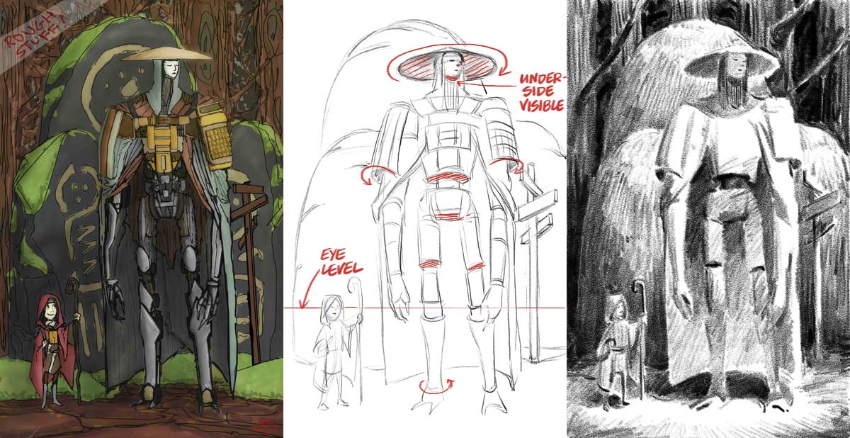
You have an interesting image here. The character design is very imaginative. I think that your problems with finishing have to do with how you STARTED the image. You have obviously spent a lot of time on the details of the image but have basically ignored the underlying structure of the image. This underlying is structure is the MOST CRITICAL component of your image because it is the first aspect that a viewer 'sees' when viewing your image. When making a picture it is useful to work from general to specific, both for efficiency and impact. You have been working 'in reverse' basically. That is why it is difficult for you to figure out where to go next. I would suggest making some thumbnails to explore alternate compositions and storytelling elements, as well as to explore different viewpoints.
This brings me to another point; which is draftsmanship. Your image currently has very minimal perspective. This is important because accurate perspective drawing is essential to making believable images. If we were to be looking at a robot that is that tall then we would be looking 'up' at him in most instances. This means that we would be seeing the underside of his forms more often than not. Simply adding subtle details like this add tremendous value to your images and immerse the viewer in your story. I added a small sketch to show you what I mean about the overall effect of the image and the addition of perspective.
Long story short: Remember perspective when drawing, and plan the big picture BEFORE worrying about the details. Hope this helps and good luck.

-Sketchbook-
"... for drawing is a thinking person's art." - Walt Stanchfield.
"... for drawing is a thinking person's art." - Walt Stanchfield.


