07-14-2013, 12:01 AM
I think for the most part you're on the right track with the anatomy and the colours.
Theres a few things I would recommend though:
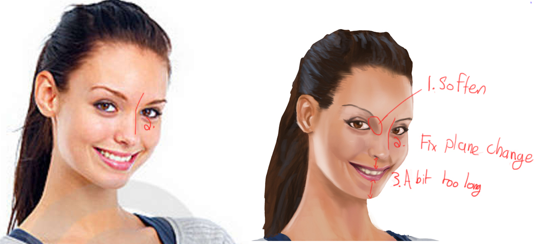
1. I would soften up the area where the eye socket and nose bridge meet on the side facing us. Its really rare that its super sharp like that and it can often seem right to make it sharp but in reality its smoother. From what i've seen it tends to get sharper the more a person is frowning but it never gets that sharp. Its almost always a gradient of some sort
2. Where the nose bridge connects to the brow looks a bit strange. In your painting it looks a bit like its bulging, or that its just swooping into it, but the switch from plane to plane is more sudden than that
3. Maybe the whole mouth region could be compressed a bit. Right now, where the upper lips connects to the nose looks a bit too long, and so does the chin. Raise the lips just slightly, and make the chin slightly shorter, not too too much though. Right now they both look too small, but I think the lips look fine as they are, just the surrounding area is too long. Edit: or You could scale up the mouth a bit
Also I think next time around you should pick a picture that's higher res. In low res pictures not only is hard to see details, but it will also make a lot of edges way softer than they really are. I would also recommend that you try to choose pictures of people with no eyeliner on. Its more of personal preference but I find that the eyeliner tends to change the shape of the eye a lot and you miss out on the real shapes of the eye
Heres a little diagram
Hope that helps


