08-06-2013, 04:13 AM
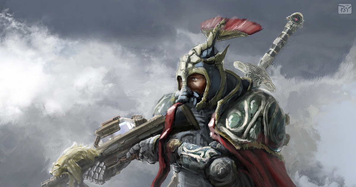
I agree, the biggest issue here is lighting. The lighting is inconsistent and inaccurate, a problem I had for quite a while in my paintings. I like to think of lighting as if Im sculpting with light. As im painting I imagine the light as particles with laser accuracy hitting things and bouncing off them.

1. First thing I did was remove the dark values because when a subject is surrounded by white clouds the bounce light off the clouds will lighten the shadows.
2. Next I Started fixing the light a bit, taking into account where shadows will fall and various forms should be defined. Really define exactly where your light is coming from early on and stick strictly to it. I also removed the bright light source from behind as its competing with the main front light source. I replaced it with some defuse bounce light from the clouds. Also the chest area was crazy dark even though light would definitely be hitting that area.
3. I fixed some perspective issues with the fuzzy hat feathers and the right shoulder armor.
4. I added some atmosphere, looks kinda like fog. This effect will really pull your subject into the scene. I usually color sample a sorta bright color off the background and with a soft brush apply it to parts of the subject I want to push back or be in fog for composition reasons.
Further suggestions I have for you but didn't have time to fix would be to get rid of the red ribbon on the gun, or put it somewhere else, it looks like a tongue, hehe. Also balance out your detail so that the focal points in the scene have the most detail. For example that sword should not be near as detailed as the helmet and shoulder. Also go easy on the photo textures. I use them often but I always paint over them after so it blends in.
This piece has great potential! Keep up the good work!


