09-08-2013, 08:22 AM
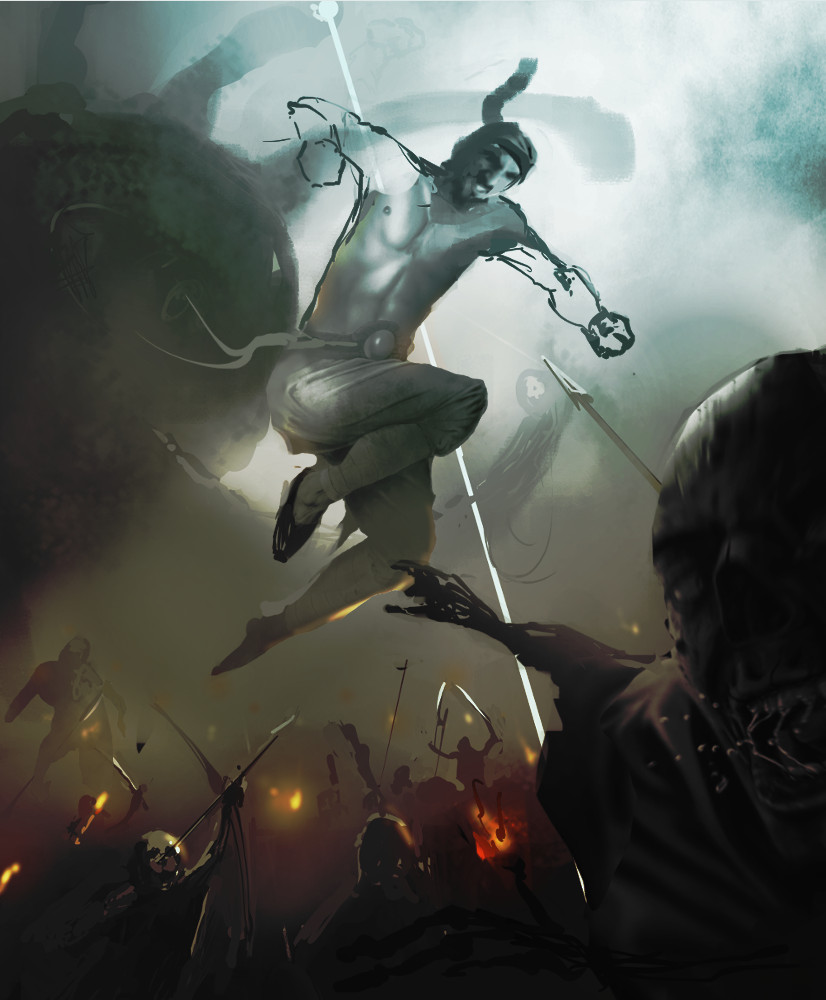
Paintover time... The long airtime leap seemed to suggest a portrait comp would be better. Tried to bolster up the beholder in the bg though I have no idea how big these guys are supposed to be according to the lore so I made him bloody humongous. I also added more doods wanting to be generally disagreeable to our hero in view. I think the pose in yours doesn't really make a whole lot of sense so I tried to add a bit of action to indicate he's ready to hulk smash and also made the expression more "grrrr" "no you di'nt girlfriend".
I think a cool sky and warm fire and smoky battle could work for a colour scheme. Hope it helps. Oh also awesome rendering on the body, it almost looks like a photo but it goes to show you have to nail the fundamentals of the image in its entirety every time before you render! Doing things piecemeal rarely ends up with good results and can cause massive headaches.

I think a cool sky and warm fire and smoky battle could work for a colour scheme. Hope it helps. Oh also awesome rendering on the body, it almost looks like a photo but it goes to show you have to nail the fundamentals of the image in its entirety every time before you render! Doing things piecemeal rarely ends up with good results and can cause massive headaches.


