09-22-2013, 02:42 PM
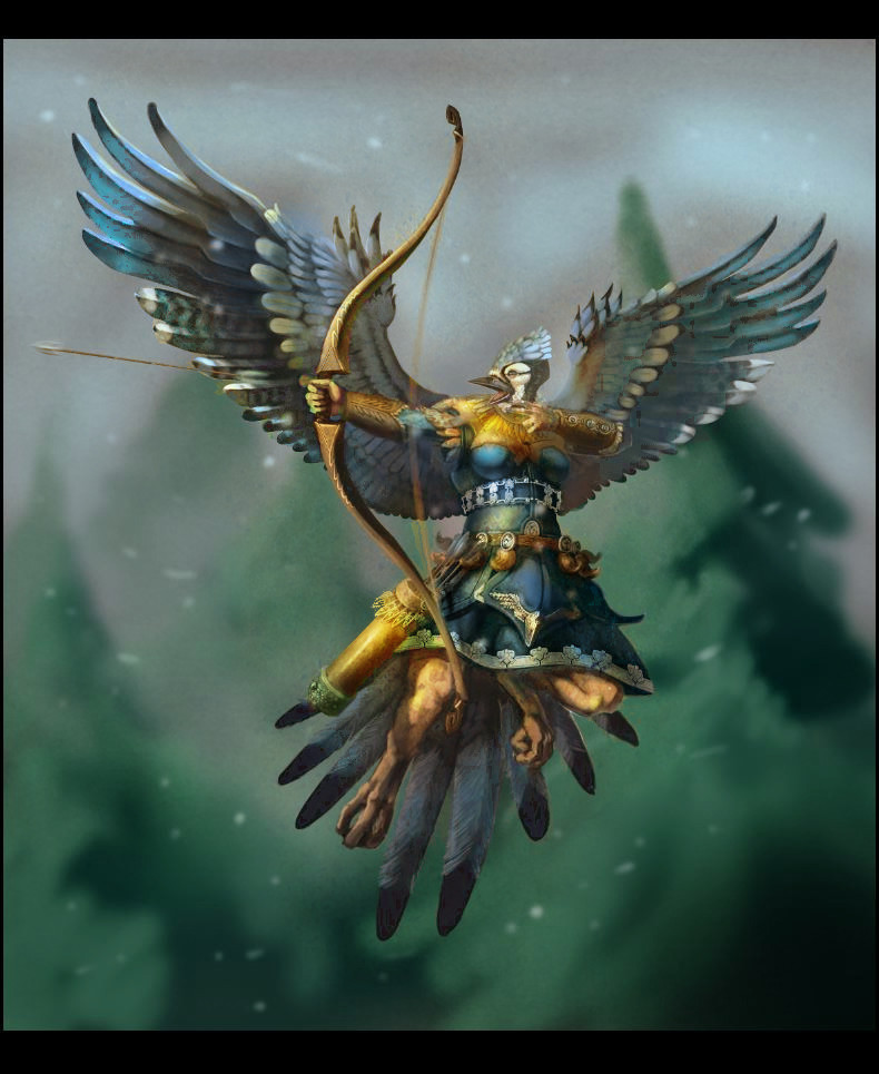
Couldn't help myself, had to play wid it. I duplicated the character and and used colour balance to try and bring out some warmer tones overall as a base. I used multiple layers of different types; overlay and color to colour glaze (like using watercolours), color dodge layers for hotspots, Normal layers for small manual adjustments as needed. Also added two subtle textures for grit and variation; one over the background mostly at 50% overlay (a cork texture for low contrast noise), another on soft light over character at 50% as well (a pocked concrete type deal with a bit more contrast and hue variation). They were both warm toned textures to counteract the cool grays in your image.
I erred on the side of over saturating to be blatant about it but you can be more subtle depending on what feel you are going for? I did lose some of your local blue in the process, but that would be fairly easy to bring back by just using a color layer over it again.

I erred on the side of over saturating to be blatant about it but you can be more subtle depending on what feel you are going for? I did lose some of your local blue in the process, but that would be fairly easy to bring back by just using a color layer over it again.


