10-14-2013, 07:18 AM
Hi Camilleon,
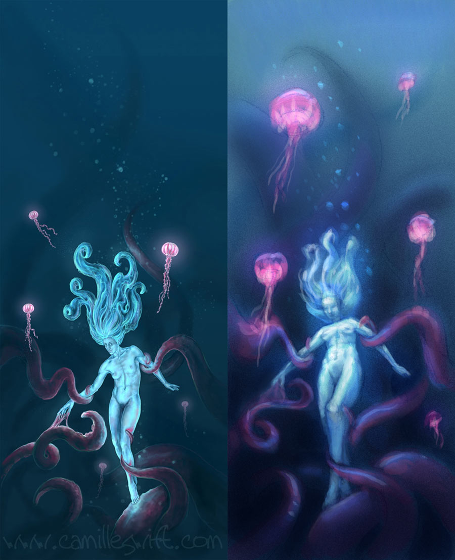
I really like the vertical format of this piece. There seems to be an interesting story going on here. As far as the composition goes, I would suggest trying a different viewpoint to emphasize the 'huge-ness' of the tentacle elements. I also think that extending the value range of the image would go a long way to creating visual interest throughout the image. Currently there are no deep darks nor bright lights. In fact the elements in the composition with the lightest value are the jellyfish. This detracts from the figure, which I assume is the true focal point. I don't think you need to add more elements to your image to generate interest. I think with a bit of re-arrangement you could increase the dynamism of the piece and utilize the space more efficiently to display detail. I made a small sketch to show you what I mean. Hope this helps.

I really like the vertical format of this piece. There seems to be an interesting story going on here. As far as the composition goes, I would suggest trying a different viewpoint to emphasize the 'huge-ness' of the tentacle elements. I also think that extending the value range of the image would go a long way to creating visual interest throughout the image. Currently there are no deep darks nor bright lights. In fact the elements in the composition with the lightest value are the jellyfish. This detracts from the figure, which I assume is the true focal point. I don't think you need to add more elements to your image to generate interest. I think with a bit of re-arrangement you could increase the dynamism of the piece and utilize the space more efficiently to display detail. I made a small sketch to show you what I mean. Hope this helps.

-Sketchbook-
"... for drawing is a thinking person's art." - Walt Stanchfield.
"... for drawing is a thinking person's art." - Walt Stanchfield.


