11-14-2013, 11:17 AM
Not a problem man, I look forward to seeing the final result when you're done.
The site design and layout are fine. I'm probably a bit picky because I design and build sites for a day job, so just ignore my comments if you think it's fine as it is :). I'm also not sure what kind of control you have over customization of a Weebly site.
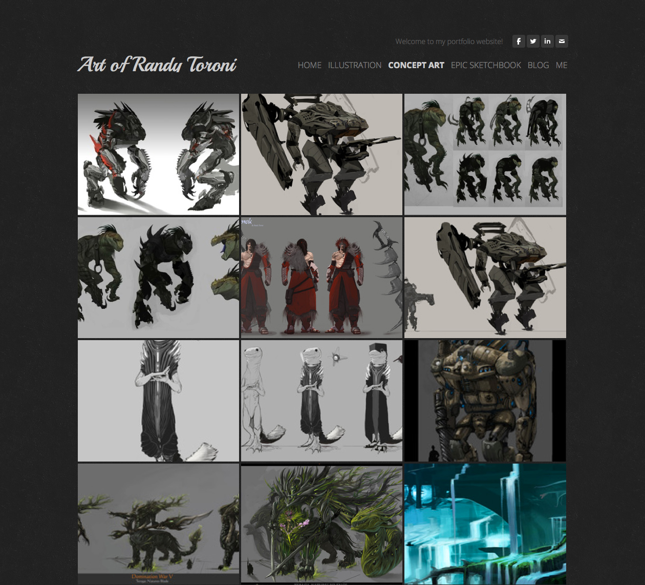
If possible, make sure the thumbnail styles are consistent for your illustration, concept art and sketchbook galleries. I personally like how tight the grid is in your concept art gallery, so I'd recommend basing your thumbnails off that. Compare it to the Illustration gallery with the deeper margins and you see your eyes flow easily from one to the other (this helps people gloss over your work quickly) in the concept art gallery, whereas in the illustration one the separation is too abrupt and the thumbnails feel disjointed.
The sketchbook thumbnails can remain a 4 column grid, just close up the gutters a bit to keep it consistent with whatever you do for the other galleries.
Order your gallery so that your stronger pieces are in the top 9 of the grid as this will be the first ones they see, and save a couple of strong pieces to end with toward the bottom.
Also, if Weebly allows you to either upload separate thumbnail art or control how the image is cropped for the thumbnail version, fix up the thumbnails so they crop the image at the best point of interest. This is most noticeable in your illustration gallery- e.g. the crotch shot of your red warrior would be better as a bust
You should remove tutorials from your navigation. You can add it back in later when you have content for this, or alternatively you could host your tutorials elsewhere like your deviant art. You want to narrow the focus of your portfolio site to present your work in its best light, and you want people judging the quality of your art, not judging the quality of how well you teach ;).
Finally, I'm a bit of a minimalist, so I'd personally get rid of the banner atop each of the different galleries. This pulls the focus back onto the work itself. You can get to the grid quicker and see more of it when you land on the page, and if you rearrange the order of your work so your best work is up the top of the grid, this becomes your new feature.
The banner doesn't really serve any purpose; It doesn't feature your work in its best light because it's too narrow to crop anything comfortably. It's also not live text so it doesn't serve any SEO purpose. You can keep it for the blog and about page to separate the body content from the header.
Less is definitely more. There's an elegance in not spelling everything out, and having the confidence that the user will know where they are in the site with something as subtle as the current page indicator in the navigation. You could draw more emphasis to it by bolding it as I've done in this example.

If there's anywhere that you can add custom CSS to your Weebly site, and you need help tweaking any of this, just let me know ;)
-NC
The site design and layout are fine. I'm probably a bit picky because I design and build sites for a day job, so just ignore my comments if you think it's fine as it is :). I'm also not sure what kind of control you have over customization of a Weebly site.
If possible, make sure the thumbnail styles are consistent for your illustration, concept art and sketchbook galleries. I personally like how tight the grid is in your concept art gallery, so I'd recommend basing your thumbnails off that. Compare it to the Illustration gallery with the deeper margins and you see your eyes flow easily from one to the other (this helps people gloss over your work quickly) in the concept art gallery, whereas in the illustration one the separation is too abrupt and the thumbnails feel disjointed.
The sketchbook thumbnails can remain a 4 column grid, just close up the gutters a bit to keep it consistent with whatever you do for the other galleries.
Order your gallery so that your stronger pieces are in the top 9 of the grid as this will be the first ones they see, and save a couple of strong pieces to end with toward the bottom.
Also, if Weebly allows you to either upload separate thumbnail art or control how the image is cropped for the thumbnail version, fix up the thumbnails so they crop the image at the best point of interest. This is most noticeable in your illustration gallery- e.g. the crotch shot of your red warrior would be better as a bust
You should remove tutorials from your navigation. You can add it back in later when you have content for this, or alternatively you could host your tutorials elsewhere like your deviant art. You want to narrow the focus of your portfolio site to present your work in its best light, and you want people judging the quality of your art, not judging the quality of how well you teach ;).
Finally, I'm a bit of a minimalist, so I'd personally get rid of the banner atop each of the different galleries. This pulls the focus back onto the work itself. You can get to the grid quicker and see more of it when you land on the page, and if you rearrange the order of your work so your best work is up the top of the grid, this becomes your new feature.
The banner doesn't really serve any purpose; It doesn't feature your work in its best light because it's too narrow to crop anything comfortably. It's also not live text so it doesn't serve any SEO purpose. You can keep it for the blog and about page to separate the body content from the header.
Less is definitely more. There's an elegance in not spelling everything out, and having the confidence that the user will know where they are in the site with something as subtle as the current page indicator in the navigation. You could draw more emphasis to it by bolding it as I've done in this example.

If there's anywhere that you can add custom CSS to your Weebly site, and you need help tweaking any of this, just let me know ;)
-NC


