12-13-2013, 03:08 AM
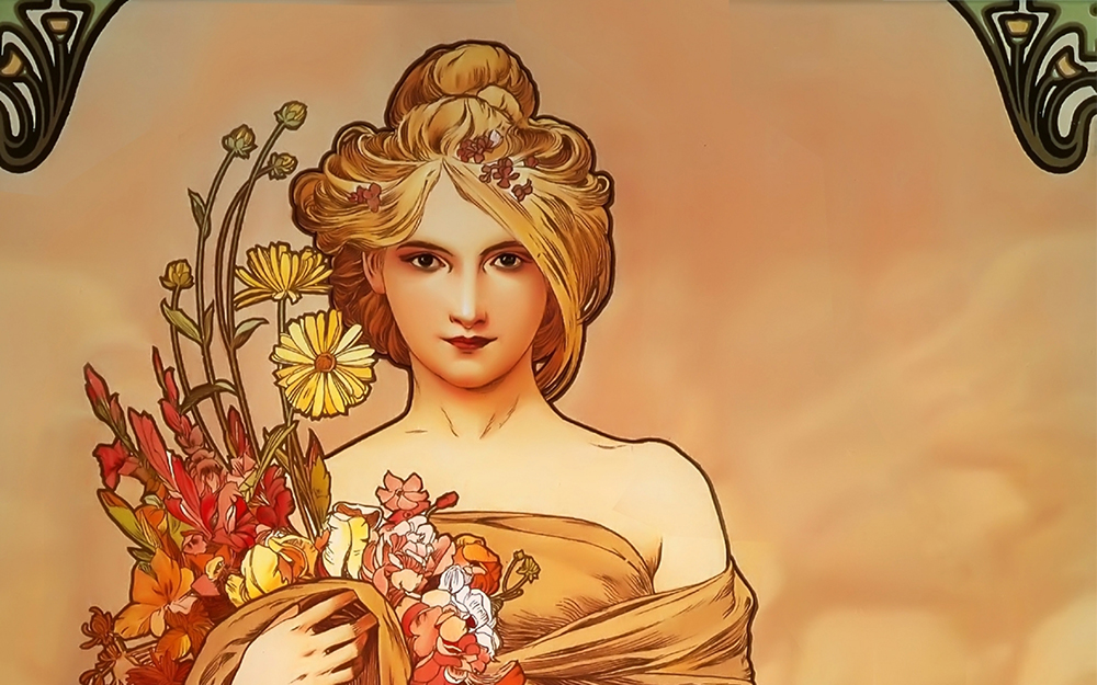
Another reason for the rough-look might be the gaps between the shapes of color and outlines. The blue paint may be lighting, but it also looks like the backgrounds showing through where you didn't paint in. I'm not sure if this is true or if this is just personal preference speaking, but for outlines to work well, it either goes the route of Mucha (clear and distinct in roping in shapes of color), gets covered by paint, or becomes part of the shapes of color.
No outline:

Assimilated outline:

Distinct outline:


No outline:

Assimilated outline:

Distinct outline:


