12-13-2013, 11:40 AM
Hi!
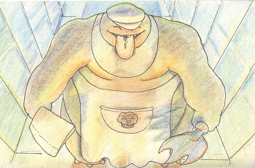
so came up with this guy some time ago, and it was my first attempt at painting two light sources, one cool, coming from behind, and one warm, coming to the front, can anyone help me with what i did right/wrong?
feel free to do a paintover or critique what you feel that could be better!

so came up with this guy some time ago, and it was my first attempt at painting two light sources, one cool, coming from behind, and one warm, coming to the front, can anyone help me with what i did right/wrong?
feel free to do a paintover or critique what you feel that could be better!


