01-08-2014, 08:01 AM
I agree with Chantal and Elmst. You need to sort out the fundamentals of the figure first before you even start to think about things like rendering and texturing. Don't be in such a rush. You're also succumbing a little bit to getting attached to the pixels already on the screen, so take a deep breath, take the advice and fix the figure pose and proportions as best you can, going back to the beginning if you need to. If you don't, it won't make a difference what you do in the texturing and rendering phase because the figure will always look wrong.
I also noticed that you have a sketch in your SB of this lady which was heavily stylised, which was great, but she seemed to be constructed really well fundamentally. This seems to not have gone through the same process? Did you do a drawing first? If not I suggest going back to that stage and fix things in the sketch first before you get to paint.
If you do decide to restart, don't be disheartened, if you spent a lot of time on this already to get nowhere. Failure is how you learn. You will probably learn a lot more by following a good workflow the second time around while keeping in mind the places you went wrong. So use the ref, do a solid drawing first. Fix all issues in the drawing, then apply paint underneath the drawing. You'll actually be able to go much quicker in the rendering phase if you're not having to fiddle with fixing stuff as you go. Do the work up front, and the rendering just becomes rendering.
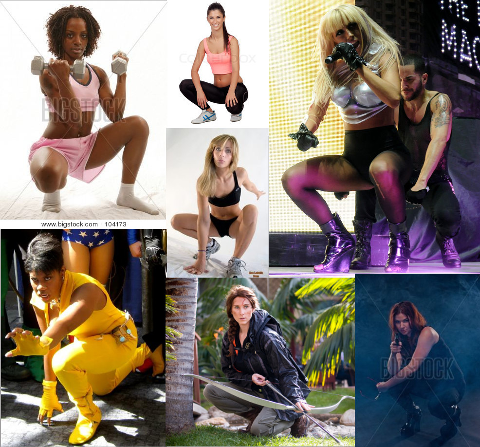
Anyway, here's some ref I gathered in about 5 minutes, searched for "crouching woman"

*EDit: Ahhh I wasn't going to do a paintover but it seemed the best way to show another thing, and that is values. you aren't getting form or depth to the painting because of your values. I put in the values on parts of your piece below. I used the ref to hack a pose together quickly that matches what you wanted (I don't recommend doing it this way...do a sketch instead) . I don't particularly like the pose you chose because it seems to unbalanced and uncomfortable to maintain easily, but I'll run with it for this demo. It's really like a mid squat pose instead of a pinup "hold" pose which is what you piece is trying to be, so I'd suggest looking at ref to nail a better one.
Anyway I'll let you examine the values on mine to figure out how it works, but basically your values had way too much range between highs and lows at every depth. The rule is basically less contrast (lower separation of values) and brighter the further back you go. That's it.

I also noticed that you have a sketch in your SB of this lady which was heavily stylised, which was great, but she seemed to be constructed really well fundamentally. This seems to not have gone through the same process? Did you do a drawing first? If not I suggest going back to that stage and fix things in the sketch first before you get to paint.
If you do decide to restart, don't be disheartened, if you spent a lot of time on this already to get nowhere. Failure is how you learn. You will probably learn a lot more by following a good workflow the second time around while keeping in mind the places you went wrong. So use the ref, do a solid drawing first. Fix all issues in the drawing, then apply paint underneath the drawing. You'll actually be able to go much quicker in the rendering phase if you're not having to fiddle with fixing stuff as you go. Do the work up front, and the rendering just becomes rendering.
Anyway, here's some ref I gathered in about 5 minutes, searched for "crouching woman"

*EDit: Ahhh I wasn't going to do a paintover but it seemed the best way to show another thing, and that is values. you aren't getting form or depth to the painting because of your values. I put in the values on parts of your piece below. I used the ref to hack a pose together quickly that matches what you wanted (I don't recommend doing it this way...do a sketch instead) . I don't particularly like the pose you chose because it seems to unbalanced and uncomfortable to maintain easily, but I'll run with it for this demo. It's really like a mid squat pose instead of a pinup "hold" pose which is what you piece is trying to be, so I'd suggest looking at ref to nail a better one.
Anyway I'll let you examine the values on mine to figure out how it works, but basically your values had way too much range between highs and lows at every depth. The rule is basically less contrast (lower separation of values) and brighter the further back you go. That's it.


