01-09-2014, 06:02 PM
Can i ask what she's supposed to be doing? It's not particularly clear. Also I think the perspective between her and the background are at odds with each other.
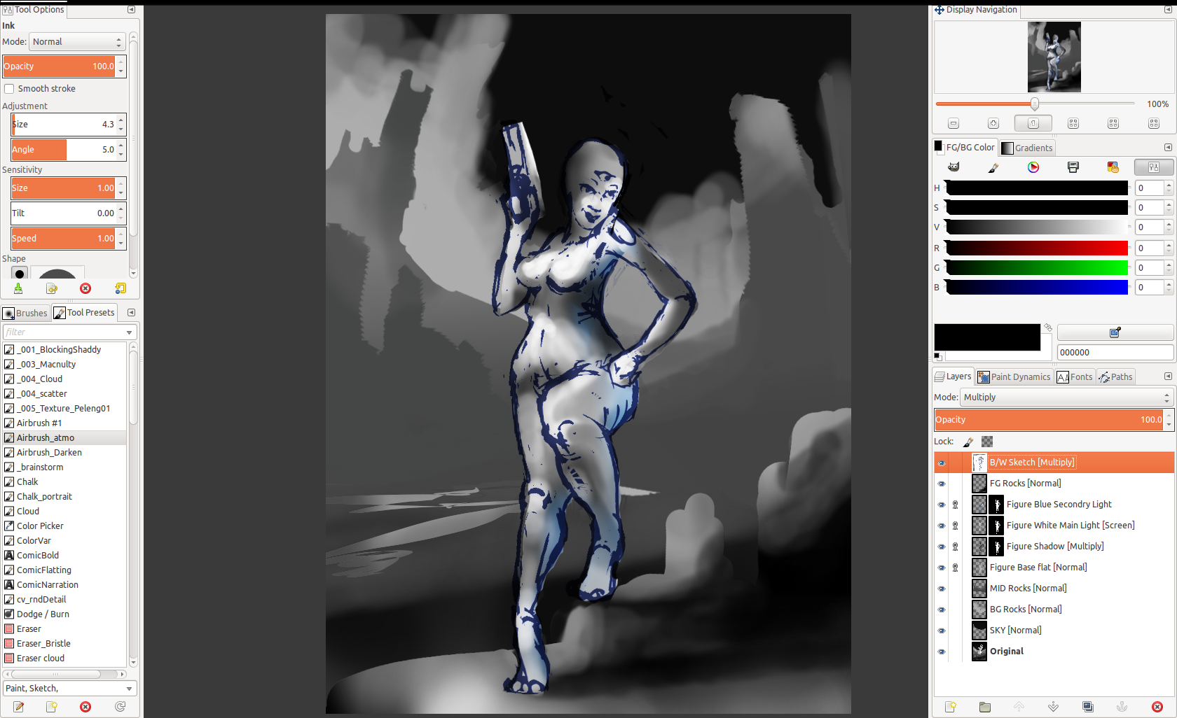
I'm in heavy procrastination mode, so I took your piece as far as I would for a basic but solid value sketch that I would be happy is resolved enough to start rendering up and doing more design work on. Having said that the values could use more work, but generally they are laid in.
I changed the pose a bit though it may not be what you are going for , but I wanted it to make more sense. This seems to be like a cheeky pinup image so I kinda went for that.
I resolved silhouette in the hills a bit more. I tried to accentuate the comp using the shapes and perspective. I also added a foreground rock element to ground her and add scale etc.
I renamed my layers on the side with what they are and what mode I used. For the figure, once I had the sketch done, I just flatted it quickly so the silhouette was clean. It was then so easy to duplicate the layer (you would use a clipping layer in PS) and lay in shadows and lighting on separate layers on the figure. It's easy to change if set up this way. I even put in some colour on a secondary lighting layer because it is so easy to colorize the layers to anything you want, to have a play with palette too.
I just used a single locked layer for all the environment layers to do some basic form gradients, but you could easily go in just like with the figure and use multiply layers for shadow and screen layers for lighting. This gives you ultimate flexibility later on.
You should also be resolving lighting at this stage. Resolving values generally means picking your lighting scheme as well. It doesn't have to incredibly detailed, but you will need to transition from the abstract flats to solid forms at some point, so it may as well be at this step.
I noticed you use a hard edge brush for everything. I tend to block in silhouettes with a hard edge full opacity, but generally use a soft brush or gradients to lay in the initial basic form value shifts, mostly because it looks more realistic quickly, and takes less fiddling than using a hard edged brush. Of course you will have to use a hard edge for things eventually, but it's just so much easier using a soft brush for this.
Basically, and once again, take your time on this stage, and don't move on until you have it looking right in all ways but the detail. If you set it up and get it mostly right, rendering will be an absolute doddle. You can just have fun with all the extra bling bits that make a piece because you're solid on the fundamental image working.


