06-09-2014, 09:20 PM
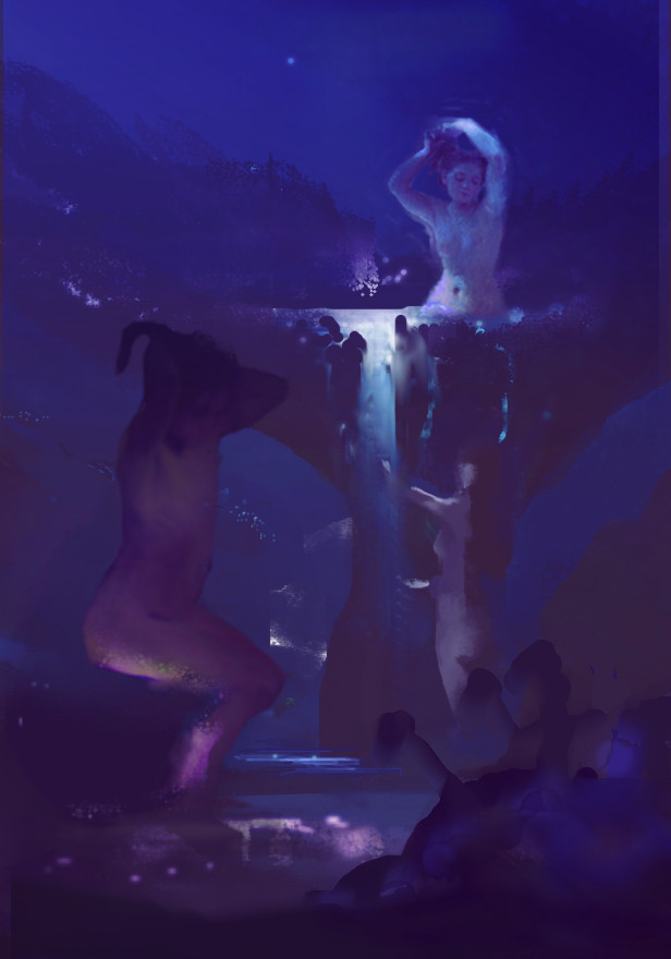
Ok man. I tweaked the comp a bit because I thought it wasn't very balanced. Created more clear value separation and counterchange in areas like the foreground figure to emphasize depth, even though overall the value range is quite low. I'm not satisfied with the comp, but I think it's a bit better.
I thought the mushroom the main bather was in was way too small to bathe in comfortably. Added some lighting effects.
Since your focus is on figures this time, really try and nail your anatomy, and find the perfect ref. One thing for female figures is to be very aware of gravity defying ginormous boobs which tend to make a piece look immature. I also recommend, like Beardsly said, trying high opacity strokes...it makes you learn quicker about getting the value and hue right for each stroke. It also keeps the rhythm and action of your strokes more dynamic and vibrant by nailing the one stroke, rather than tentatively building up with a billion low opacity ones.
Couldn't do a proper job as you know why. F it is hard to do shit with a mouse.
Hope it helps?


