09-22-2014, 09:29 AM
Hey there!
Really cool design you have here :D digging the pose and I see what you did there with the makeup... very Geisha-esque~
Hmm, well if your goal was to portray a more realistic figure - make sure you have a combination of hard/soft and lost edge in your painting.
Keep this in mind:
![[Image: Paintover01.jpg]](http://www.gregpro.com/forums/Conceptorg/Paintover01.jpg)
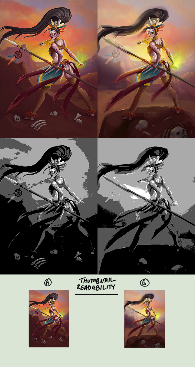
I did a quick paintover to show you the importance of thumbnail readability, seeing as the audiences first look at your piece depends on this and whether or not they're been enticed to click on the thumbnail... I thought I'd make note of its significance.
In addition, I worked on tension areas in the original (such as the right leg), separated the foreground/midground/background and tried to emphasize the lighting to improve readability as well.

Also hahaha whaaaaat! I can't rate people! That's all on you :D!
If you know there are areas of your art you're unhappy with -- hunt down your weaknesses and try your hardest to beat them down one at a time :) also, if you compare your work to one of your favourite artists - how do you feel? Do you feel like you're on the same level? Or are you confused how they make their art look the way it does? Ask yourself these questions and try to answer them as you continue.
If you want to improve, remember to keep your mind open to new ideas... try to be curious like a child and seek knowledge in what you're unsure about. And that doesn't just have to relate to art ^ ^
Anyways haha
I hope this helps you in some way
Keep fighting! o/
Really cool design you have here :D digging the pose and I see what you did there with the makeup... very Geisha-esque~
Hmm, well if your goal was to portray a more realistic figure - make sure you have a combination of hard/soft and lost edge in your painting.
Keep this in mind:
![[Image: Paintover01.jpg]](http://www.gregpro.com/forums/Conceptorg/Paintover01.jpg)
I did a quick paintover to show you the importance of thumbnail readability, seeing as the audiences first look at your piece depends on this and whether or not they're been enticed to click on the thumbnail... I thought I'd make note of its significance.
In addition, I worked on tension areas in the original (such as the right leg), separated the foreground/midground/background and tried to emphasize the lighting to improve readability as well.

Also hahaha whaaaaat! I can't rate people! That's all on you :D!
If you know there are areas of your art you're unhappy with -- hunt down your weaknesses and try your hardest to beat them down one at a time :) also, if you compare your work to one of your favourite artists - how do you feel? Do you feel like you're on the same level? Or are you confused how they make their art look the way it does? Ask yourself these questions and try to answer them as you continue.
If you want to improve, remember to keep your mind open to new ideas... try to be curious like a child and seek knowledge in what you're unsure about. And that doesn't just have to relate to art ^ ^
Anyways haha
I hope this helps you in some way
Keep fighting! o/
sketchbook | pg 52
"Not a single thing in this world isn't in the process of becoming something else."
I'll be back - it's an odyssey, after all
"Not a single thing in this world isn't in the process of becoming something else."
I'll be back - it's an odyssey, after all


