10-03-2014, 03:03 AM
I think the coloring is beautiful! Its really pleasant for the eyes : )
What I would change is maybe where finn and the grave is placed in the picture, I can't really explain why, but it feels off.
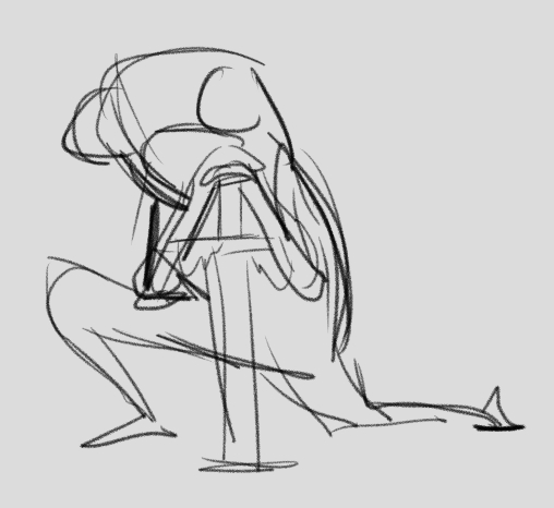
I would also change how he holds that sword, he is supposed to be reclining against it and then it would be better if you could feel that he is putting his weight on it

like so but better obviously ^^
Otherwise it looks great to me : ) like i said love those colors!
What I would change is maybe where finn and the grave is placed in the picture, I can't really explain why, but it feels off.
I would also change how he holds that sword, he is supposed to be reclining against it and then it would be better if you could feel that he is putting his weight on it

like so but better obviously ^^
Otherwise it looks great to me : ) like i said love those colors!


